 Are you using Twitter advertising to promote your business?
Would you like to improve your advertising on Twitter?
Twitter's new campaign reports help you understand how users engage with your paid content.
In this article you'll discover how to navigate the Twitter Ads reporting platform to obtain quality insights about your target audience.
Why Use Campaign Reports?
Effective advertising goes beyond the actual marketing campaign. It requires you to analyze data and identify key information to help improve business results in the future.
Twitter advertising has an excellent campaign analytics tool that's easy to use, regardless of your experience with Twitter Ads.

Some of the benefits include:
- Multiple data breakdown for extensive analysis
- Report segmentation
- Metrics clustered in groups for easy reading
- Interactive trend chart
Here's a guided tour of the Twitter Ad Reporting platform.
#1: Navigate the Main Dashboard
Twitter's campaign report dashboard displays automatically when you log into your advertising account. The interface is divided into three main sections: charts, reports and audience segments.
Chart Area
The most prominent element of the dashboard is a Trend chart, which can change depending on three factors:
- Main metrics
- Segments
- Data breakdown
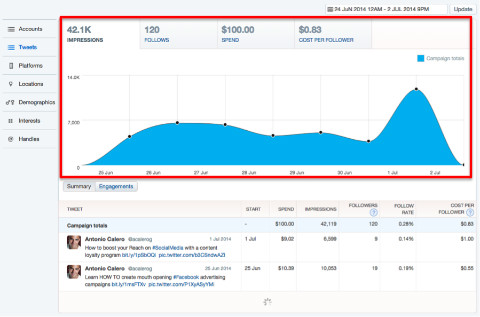
Click on the Trend chart to reveal the following tabs above the Trend chart:
- Impressions: Selected by default, number of users who've seen your ad.
- Engagements/Follows: All actions taken by users who've seen your ad, based on the goal of your campaign.
- Spend: Investment amount used by your account. Be especially aware of this if you manage several accounts in multiple currencies.
- Conversions/Cost per Follower: If your campaign includes conversion tracking, this report shows how many conversions you obtained. On promoted account campaigns, it will show the cost per new follower.
Click on each of these tabs to generate a new chart for the selected metric.
Get World-Class Marketing Training — All Year Long!
Are you facing doubt, uncertainty, or overwhelm? The Social Media Marketing Society can help.
Each month, you’ll receive training from trusted marketing experts, covering everything from AI to organic social marketing. When you join, you’ll also get immediate access to:
- A library of 100+ marketing trainings
- A community of like-minded marketers
- Monthly online community meetups
- Relevant news and trends updates
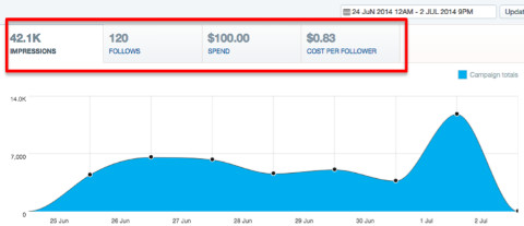
The figures on each of the metrics also change depending on the time period selected.

Change the time period in the field located in the upper-right corner of the dashboard.
Detailed Reports
Below the chart area are reports for the selected segment with a breakdown of the above-mentioned metrics.
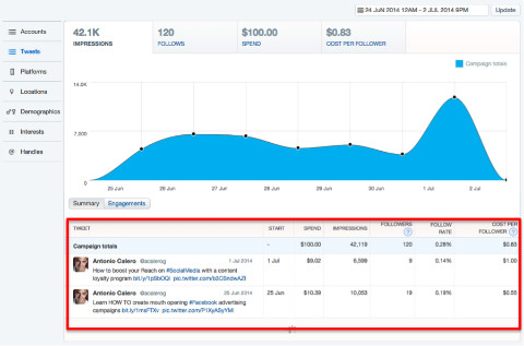
While the figure displayed at the top of each tab gives you a total number, the reports provide details for all of the elements related to each metric.
To show a report, simply click on the button with the metric name, located in the lower-left area below the chart.
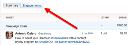
There's one detailed report for each of the metrics.
Audience Segments
The left-hand column contains a list of segments that provide a data breakdown for each of the reports mentioned previously.
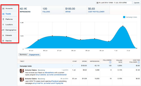
When you click on each of the segments to generate a new report, the data displayed in the chart and top tabs remains the same.
Once you have selected the main metric you want a report on, it's time to get into detail.
#2: Generate Detailed Reports
To select the campaign you want to analyze, click on the campaign name on the detailed report.
Once you do this, the whole screen will refresh. The tabs at the top of the page will show different figures, the left column will include new segments and the detailed report section at the bottom will also look different and display the elements for the selected segment. (This example shows tweets used on the campaign selected.)
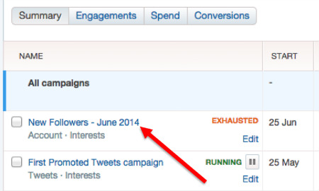
Be aware that the time range could have changed; so make sure you are still reporting on the correct period.
Here's what you can find under these reports.
Summary
When you click on Summary, you'll have access to a quick report that contains the following elements:
- Start: The date when each of your tweets started to be used in the campaign. Most likely they will all show the same date, unless you decided to include a new tweet in your campaign at a later date.
- Spend: Amount of money spent on each of the ads. The sum is the total spent on your campaign.
- Impressions: How many times each of your tweets has been served to users.
- Link Clicks: All clicks on a link or website card in your tweet. This includes clicks you're not being billed for, such as when the same user clicks twice.
- Cost per Link Click: The total spend divided by the total number of clicks. This includes clicks you're not being billed for.
- Click Rate: This is the click-through rate for your tweets: impressions divided by number of clicks.
The first row of each report (the one just below the headings, highlighted in blue) contains the campaign totals.

Report totals are the sum of each of the elements reported. Ratios are calculated based on the figures of this same row, not on the averages of the elements below.
Engagements

Discover Proven Marketing Strategies and Tips
Want to go even deeper with your marketing? Check out the Social Media Marketing Podcast! Publishing weekly since 2012, the Social Media Marketing Podcast helps you navigate the constantly changing marketing jungle, with expert interviews from marketing pros.
But don’t let the name fool you. This show is about a lot more than just social media marketing. With over 600 episodes and millions of downloads each year, this show has been a trusted source for marketers for well over a decade.
Click on the Engagements report and you'll see there's a breakdown of engagement-generating actions taken by users who saw your promoted tweets, which are:
- Impressions: This is the same figure as in the previous menu. It is displayed again here only as a reference.
- Clicks: While the summary report shows link clicks only, this one includes all clicks for any element of your tweet, including hashtags, account name, names of other users, images, cards, and of course, links.
- Retweets: Number of times your content was retweeted by users.
- Replies: Number of times your ad received a reply.
- Followers: Number of users who started following you as a result of your tweet. If your campaign is for a promoted tweet (and not an account), this action counts when users click on the Follow Account button.
- Engagement Rate: The ratio of the total number of actions (clicks, retweets, replies and follows) divided by the number of impressions.
Conversions
This report is available only if you are tracking conversions as part of your campaign. It shows how each promoted tweet contributed to your campaign's overall results.
When you click on the Conversions button, your report will display the following data:
- Spend: Amount spent on each ad.
- Conversions: The name of this column will be different, depending on the type of conversion you configured when you created your conversion tracking code.
- Total Conversions: Number of users who converted to your campaign goal.
- Cost per Conversion: Also referred to as cost per acquisition (CPA), it's calculated by dividing the total spend by the number of conversions.
- Conversion Rate: Number reported for each ad.

So far we've been reporting on the tweets used on a campaign. However, to get user insights and demographic data, let's explore audience segments.
#3: Analyze Audience Segments
The audience segments, displayed in the left-hand column, vary depending on the type of campaign and targeting you used. Click on each segment to generate a new report that includes sub-elements, as well.
For example, select the platform segment, and get a report similar to this:

This new report contains the same metrics explained previously. However, data will be broken down by the following elements:
- Tweets: Usually this segment is selected by default and as the name suggests, displays all tweets used as part of a campaign.
- Platforms: Selecting this segment will display your report with a breakdown of the device and operating system your ads were displayed through.
- Locations: This segment shows a breakdown by geographic area. By default it will show country, but we'll get into more detail in a moment.
- Demographics: User data with gender and language information.
- Interests: After analyzing trends, Twitter will report behavioral data for topics your target audience likes to comment about.
- Handles: If you targeted users based on the accounts they follow, this segment will report how each of those accounts “contributed” to your campaign results.
Interactive Chart
One of the most interesting features of Twitter campaign reports is the interactive chart, which represents data based on the main metric and specific elements of a segment.
Click on any row of any of the reports, and see how the chart changes to report information only for that particular element.
For example, the following chart represents impressions across all platforms.
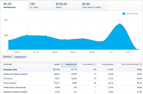
Click on a new tab/metric on the top of the chart and on a specific row in the report underneath, and a new chart representing the changes is displayed.
In this chart I selected Follows for Android Devices.
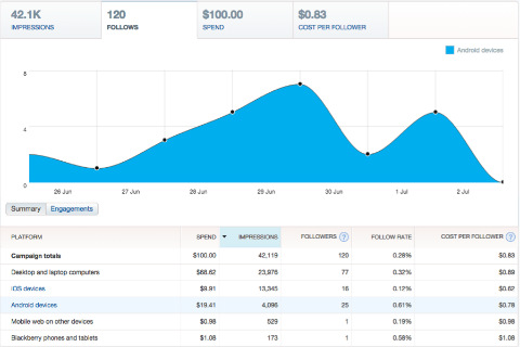
The interactive chart is helpful for quick analysis of a variety of metric combinations.
More Detailed Information
As you dig into data using the Segments menu, you'll discover some of the segment elements are marked in blue. This means that element contains sub-elements that provide additional data.
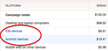
There are two segments where you can find additional information for your reports: platforms and locations.
Platforms
This segment provides additional information for iOS and Android devices. The report contains two groups of data reporting: by devices or operating system.
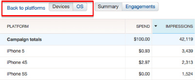
Platform reports are especially useful if you're using Twitter to promote an app for smartphones or are planning to develop one.
Locations
By default, locations will display a report with a breakdown by country. In some cases Twitter also provides information by state or region, metropolitan area and even postal code.
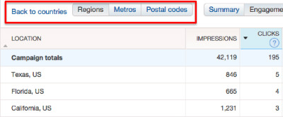
To access this level of detail, click on one of the country names marked in blue. At the top of the new report, there are buttons that allow you to change the geographic level. You can also go back to the previous report.
Conclusion
The Twitter Ad reporting platform offers a good range of advertising products and reporting tools that can easily be configured. Use the information from the report to run better campaigns and create better content, products and strategies.
What do you think? What is your experience with Twitter Ads? What type of data do you find more useful to analyze in your campaigns? Have you used that data in any effective way that has helped your business? Please share your thoughts in the comments.
Attention Agency Owners, Brand Marketers, and Consultants

Introducing the Marketing Agency Show–our newest podcast designed to explore the struggles of agency marketers.
Join show host and agency owner, Brooke Sellas, as she interviews agency marketers and digs deep into their biggest challenges. Explore topics like navigating rough economic times, leveraging AI, service diversification, client acquisition, and much more.
Just pull up your favorite podcast app, search for Marketing Agency Show and start listening. Or click the button below for more information.

