 Is your Facebook page ready for the new design?
Wondering what's changing?
In this article, you'll discover how to prepare for the new Facebook page layout.
Note that until the design has been released to everyone, Facebook may still make some final tweaks to the design based on user feedback.
The Old Design vs. the New Design
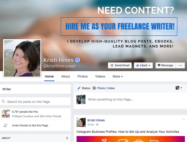
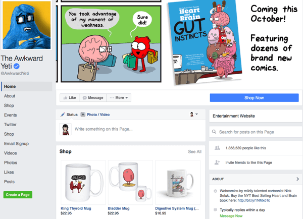
First off, let's look at the difference between the old/current design versus the new/upcoming design. This is the old/current design as seen by visitors to your page.
And this is the new/upcoming design as seen by visitors to your page.
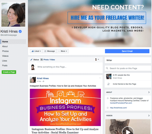
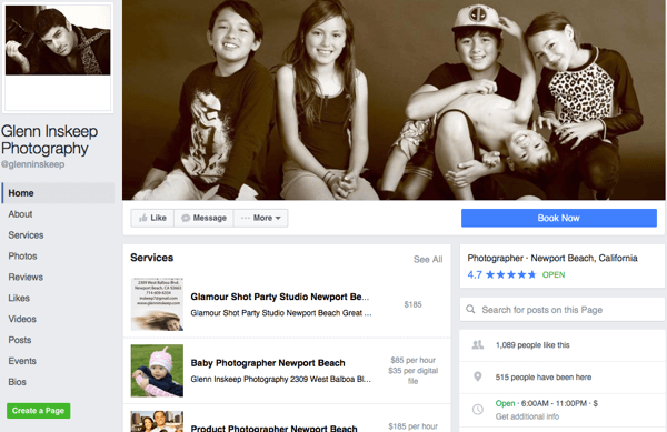
For those who have set up Facebook shops, those will appear above your status updates.
The same goes for those who have set up a Services section on their Facebook page.
For page admins, the new/upcoming design looks like this.
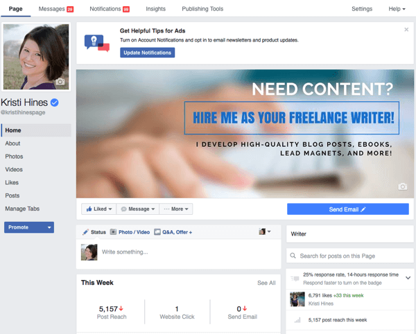
The main menu options on the top bar are the same, and the content within them are still the same, design-wise. The biggest change for admins is that the Promote button, which was to the top right of the cover photo on the current/old design, is now in the left sidebar at the bottom.
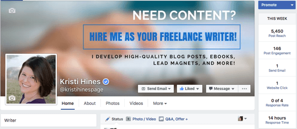
And statistics that were below the Promote button to the top right of the cover photo are now below the status update box.
Now that you've seen the plans, let's break down some important parts so you know what to prepare for when the new design becomes available for your Facebook page.
#1: Design Your Cover Photo Without Worrying About Overlap
Previously, your Facebook page's cover photo was covered by your profile photo, page name, username, call-to-action (CTA) button, Like button, Message button, and additional options button. But with the new design, your cover photo will be shown in all of its glory.
Get World-Class Marketing Training — All Year Long!
Are you facing doubt, uncertainty, or overwhelm? The Social Media Marketing Society can help.
Each month, you’ll receive training from trusted marketing experts, covering everything from AI to organic social marketing. When you join, you’ll also get immediate access to:
- A library of 100+ marketing trainings
- A community of like-minded marketers
- Monthly online community meetups
- Relevant news and trends updates
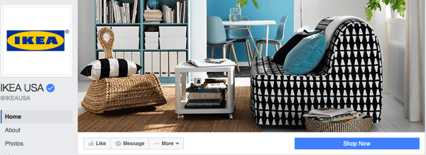
This means no more designing around all of those other elements. You can design your cover photo to show off your brand's uniqueness, products, or services like IKEA does on its Facebook page. Facebook's Help page currently recommends that you size your cover photo to be displayed on desktop browsers at 828 pixels wide by 315 pixels tall, and on mobile browsers at 640 pixels wide by 360 pixels tall.
Hence, your cover photo should be at least 828 pixels wide and 360 pixels tall. Be sure to test your cover photo on desktop browsers and mobile browsers to make certain the main features of your cover photo are shown on both. This is important especially if you have text, because parts may get cut off and need to be rearranged.
If you don't have good photos and aren't a designer, you can always use stock photos or services like Canva to create a Facebook cover photo for your page.
#2: Add a Call-to-Action Button
Thanks to the bright, bold, new CTA button design, there's almost more of a chance that people will click your CTA than your Like button. Therefore, if you haven't already done so, now is the time to add a CTA button to your page. Otherwise, your page will look like there's something missing.
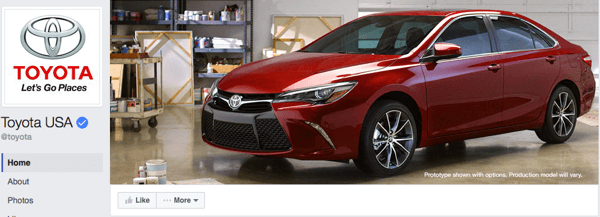
As you can see on the Toyota Facebook page, the missing CTA button leaves a long, blank space underneath the cover photo. On one hand, it might lead more people to click the Like button. On the other hand, the car company may miss out on people taking other actions, such as going to their website.
Discover Proven Marketing Strategies and Tips
Want to go even deeper with your marketing? Check out the Social Media Marketing Podcast! Publishing weekly since 2012, the Social Media Marketing Podcast helps you navigate the constantly changing marketing jungle, with expert interviews from marketing pros.
But don’t let the name fool you. This show is about a lot more than just social media marketing. With over 600 episodes and millions of downloads each year, this show has been a trusted source for marketers for well over a decade.
By comparison, the Subaru Facebook page's CTA button encourages people to contact the company.
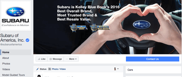
Also, note that the CTA button is important not only for your desktop Facebook page visitors but also for your mobile visitors.
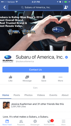
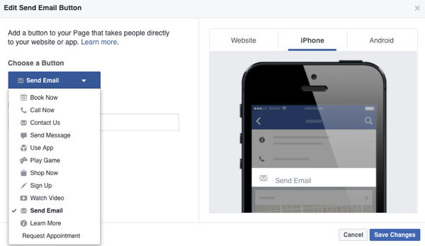
You can create different CTAs for desktop and mobile users. For example, you can set the CTA so mobile users have the option to call instead of go to your website, if that's the preferred option.
#3: Make Sure That All of Your Tabs Have Content
Previously, things like the About tab were a little less prominent, so having your information filled out completely wasn't as big of an issue. Now that tabs are on the left sidebar and are stationary as visitors scroll down your page, visitors are more likely to click on them.
Hence, now is the time to make sure you have your About tab filled out.
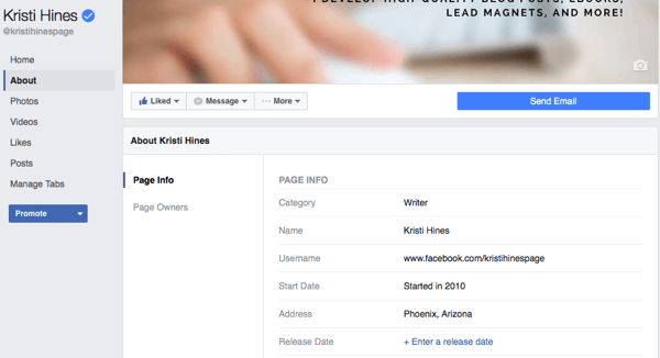
Also, since you can't get rid of main tabs like Photos and Videos, be prepared to create some visual content to go in your main tabs as well. Ideally, you'll want to add at least one featured video so people can get a good impression of your brand, products, or services. The featured video not only appears on the Videos tab, but will also appear above your About box, now on the right side in the new/upcoming design.
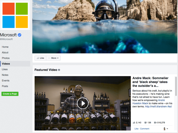
You may also want to consider removing tabs that don't contain current content, such as an Events tab where you no longer post new events. That way, people aren't clicking on things that don't have relevant content. This also applies to any custom tabs you've created.
Speaking of which…
#4: Add Custom Tabs
With the current/old design, you could only show four tabs, and the rest would be put under the More drop-down menu. Because the Home and About tabs were stationary, that only left room for two custom tabs to be shown to visitors to your page, as shown below.
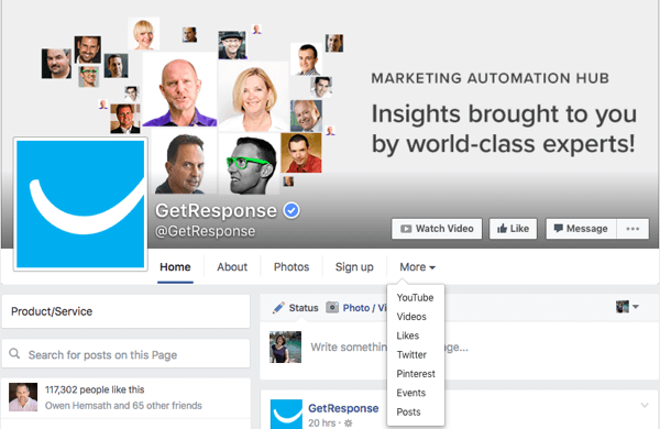
This meant if you wanted to add custom tabs (for example, to get email subscribers, show off your YouTube channel, share your tweets, and show off your pins like GetResponse does on their Facebook page), most of those options would be hidden under the More drop-down menu. But with the new design, all of those custom tabs are shown in the left sidebar.
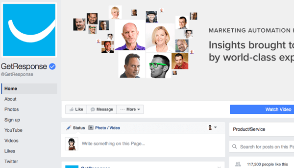
Now, those custom tab links stay in place while visitors scroll down the page, so they always have the option to click on them while browsing the page's posts. So if you were considering doing so, now is the time to add custom tabs for custom features.
In the GetResponse example, the Sign Up tab is created by their web form builder. The social tabs for YouTube, Twitter, and Pinterest can be created by services like Woobox. If you're looking for something more specialized and have developer skills, you can learn more about developing your own tabs here.
In Conclusion
From here, your goal is to continue your Facebook marketing strategy as usual. Continue regularly posting a variety of content that engages your target audience. Experiment with Facebook's latest features like Notes and Live video. Reach more of your target audience through Facebook advertising.
What do you think? Have you seen the new Facebook page design? What else are you planning to do to prepare your page to impress visitors? Let us know in the comments!
Attention Agency Owners, Brand Marketers, and Consultants
Introducing the Marketing Agency Show–our newest podcast designed to explore the struggles of agency marketers.
Join show host and agency owner, Brooke Sellas, as she interviews agency marketers and digs deep into their biggest challenges. Explore topics like navigating rough economic times, leveraging AI, service diversification, client acquisition, and much more.
Just pull up your favorite podcast app, search for Marketing Agency Show and start listening. Or click the button below for more information.
