Want to improve your cost per click for Facebook ads?
Wondering how much influence visuals have on Facebook ad performance?
From font style to background images, the design choices you make can have a deep impact on the overall results of your Facebook ad campaigns.
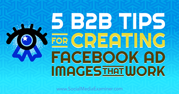
In this article, you'll discover five tips for creating B2B Facebook ad images that generate results.
A Data-Backed Approach to Facebook Ad Design
Many expert marketers recommend focusing on the copy of your ad, and while this is great advice, it's also important to combine your copy with a click-worthy image.
What makes an image click-worthy? To determine which specific visual elements result in the most clicks at the lowest cost, I analyzed the response to almost 50 images from a single ebook promotion campaign. I made no changes to the audience, copy, budget, or duration of the ad, only to the social media images themselves.
Keeping in mind graphic design trends, the test consisted of a single Facebook campaign and individual ad sets, with each set comprised of its own ad for each visual. Each ad ran for two weeks and at the end, I tested the top five ads again for good measure.
If you want to run your own experiment, take a look at the image components I tested:
- Font style: serif and sans serif font styles; uppercase versus lowercase font pairings
- Text size and position: larger text versus smaller text; left- and right-aligned text versus centered, top or bottom placement of text
- Image color: four color palettes for image backgrounds; vibrant, pastel, neutral, and dark

- Illustration usage: images that are illustration- and icon-heavy
- Stock images: images consisting only of various stock photos of a person, animal, location, and food or beverage
- Calls to action: inclusion and exclusion of a clear call to action
- Company branding/logo usage: visuals heavily branded with company colors and logos versus product shots
- Memes and pop-culture references: the effectiveness of popular memes on click-through rate
- Image fractions: showing only part of a larger image
- Before and after: “before and after” visuals
- Charts and data visuals: use of charts, graphs, and data
Now let's look at some takeaways from this test that you can apply to your Facebook ad visuals.
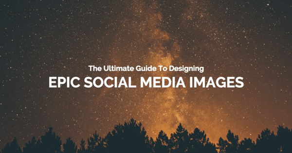
#1: Use a Darker Background Color
Visuals that included a darker background color received 136% more clicks than the sample average. On top of that, the cost per click for ads with a darker background was 18% less than the average cost per click.
Of those who clicked on the ad, 87% submitted their email addresses to access the ebook.
Here's the ad visual used in the test:
Why did this dark image perform so much better than its brighter equivalent? After all, many psychologists will agree that people are drawn to brighter colors; they stand out and demand our attention from great distances.
But darker colors can convey power, authority, and sophistication. So when you present new information, a black background can associate your message with intelligence to some degree.
3 Days of World-Class Training—Zero Travel!
Couldn't make it to Social Media Marketing World and AI Business World this year? Get all of the great content at a fraction of the price with a Virtual ticket.
That’s full access to recordings of every keynote, workshop, and session—the ones people travel thousands of miles to see. Don't wait. Get your Virtual ticket and enjoy actionable content that you can watch anytime, anywhere.
Another reason this image likely worked is that the dark background stands out from the white background of the Facebook news feed. No matter what the reason, people agree that black is appealing for Facebook ad visuals.
Want to Unlock AI Marketing Breakthroughs?
If you’re like most of us, you are trying to figure out how to use AI in your marketing. Here's the solution: The AI Business Society—from your friends at Social Media Examiner.The AI Business Society is the place to discover how to apply AI in your work. When you join, you'll boost your productivity, unlock your creativity, and make connections with other marketers on a similar journey.
I'M READY TO BECOME AN AI-POWERED MARKETER#2: Include a Clear Call to Action
During this experiment, I also tested visuals that included a product shot and a clear call to action. Images like the one below had a cost per click of 47% less than the average and received on average 35% more clicks than the average ad set.
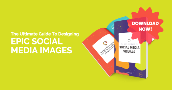
If you include a visual of an actual book or show the product in tangible form, you can play to your audience's sense of touch. People like to see what they're getting, even if the offering is a digital product.
A call to action is also crucial when you want your audience to take action and remain engaged. The clear Download Now message demands an immediate response from the person viewing your add. Of the people who clicked this ad, 94% submitted their email address to download the ebook.
#3: Use Location Images
During this test, one surprising result is that stock photos on average performed poorly in comparison with other visuals. The lone exception was stock photos of locations.
During the first test, the image below resulted in a cost per click of half of the overall average.
In the second test, this time overlaying product shots, the image performed better than all other ad visuals in the campaign. It received 20% more clicks than the average and had a cost per click of 8% lower than the average.
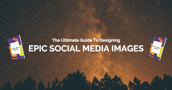
Note that this image has a dark background, so it stands out better in Facebook's lighter news feed, again suggesting darker images result in better click-through rates.
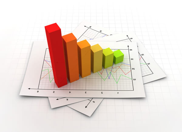
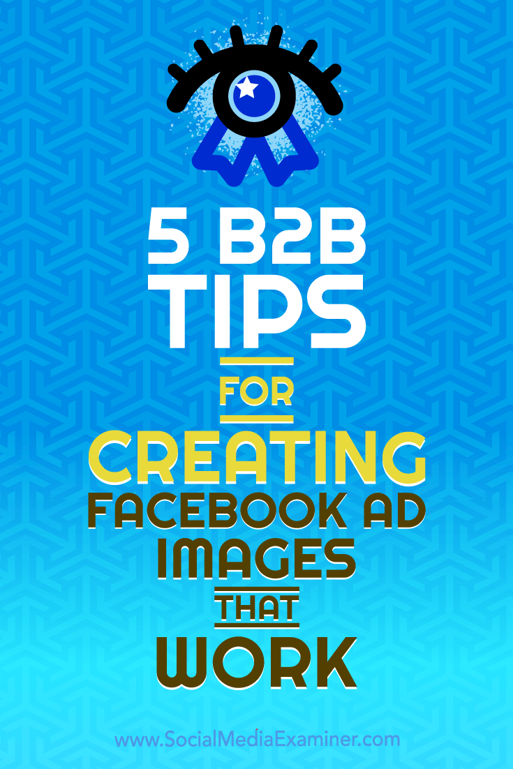
#4: Include Charts to Suggest New Research
Of the top-performing ad visuals, images that included a chart or some form of data visualization performed better than the average. In fact, images including charts received 121% more clicks than the average.
The assumption is that charts suggest growth or an increase in metrics. Graphs also imply new research or information. So when you're promoting findings from a survey, using a chart in your ad visual can contribute to a higher click-through rate.
Another design element that made this visual a winner is the use of contrasting colors. The bright yellow on blue makes the image pop in the Facebook news feed. The magic wand icon directs the reader's eyes to the title of the ad, increasing the likelihood they'll read the title.
#5: Stick to Sans Serif Fonts
Visuals with left-aligned, sans serif fonts performed 30% better on average than visuals with serif fonts.
Despite being considered the more “legible” style of font, serif fonts performed poorly throughout the Facebook ads test. The likely reason is that we're constantly exposed to sans serif fonts like Arial, so we're more drawn to the style. Note that both Google and Facebook default to sans serif.
As for text positioning, it makes sense that people prefer left-aligned text, as we're naturally accustomed to reading from… well, left to right. Also, larger text performed better overall than smaller text; the larger the text, the easier it is to read, after all.
Conclusion
When designing Facebook ads that convert, compelling copy is important; however, the image is what people see first. Use the tips above when creating and testing your own Facebook visuals to lower your overall cost per click and increase engagement with your ads.
What do you think? What visuals work best for your Facebook ads? What tips can you offer? Please share your thoughts in the comments below.

Curious About How to Use AI?
Our newest show, AI Explored, might be just what you're looking for. It's for marketers, creators, and entrepreneurs who want to understand how to use AI in their business.
It's hosted by Michael Stelzner and explores this exciting new frontier in easy-to-understand terms.
Pull up your favorite podcast app and search for AI Explored. Or click the button below for more information.