Wondering if the people you send to your website find what they're seeking? Want insights to improve the customer journey?
In this article, you'll discover how to analyze your website visitor engagement in Google Analytics. You'll also learn how to see which audience segments spend more time on your website and find opportunities to adjust what visitors see when they first land on your site.

To learn how to use three Google Analytics reports to discover how people engage with your website, read the article below for an easy-to-follow walkthrough or watch this video:
Google Analytics and the Customer Journey
Before we jump into analytics, let's talk about why you'd use Google Analytics in the first place. Think about it in terms of a conversation. People are coming to your site and your site is having a conversation with them to hopefully get them to become customers.
If you think about it, that's what happens when people visit an offline store. They have to interact with a salesperson who helps them purchase their products. Your website is basically doing the same thing and Google Analytics is how you can listen for that conversation and understand how users are interacting with your website.
Another way to think about the conversation is engagement. In Google Analytics, you can look at a report and see the engagement level of website visitors. If they're not engaging at all, it means they're having a bad conversation and you might want to change some of the marketing messages. If they're engaging a lot, you'd expect that they would ultimately become purchasers.
Now let's look at Google Analytics reports where you can find this data.
#1: Analyze Website Visitor Engagement by Traffic Source in Google Analytics
Start by jumping into my favorite report: the source/medium report. From the Google Analytics home screen, go to Acquisition > All Traffic > Source/Medium in the left navigation.
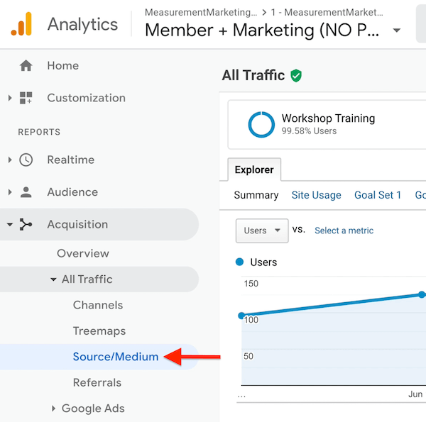
The source/medium report tells you where your website traffic is coming from and the amount of traffic you're getting from these different traffic sources. It also shows your engagement metrics, and ultimately, the results of all of that engagement.
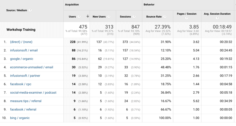
If your report doesn't look like mine, that's because I'm using something called UTMs. Make sure you're properly using UTMs to tag your traffic as well. Read this article to learn how to set up UTMs.
In the source/medium report, we're going to focus on the Behavior section, which includes three main metrics for engagement:
Get World-Class Marketing Training — All Year Long!
Are you facing doubt, uncertainty, or overwhelm? The Social Media Marketing Society can help.
Each month, you’ll receive training from trusted marketing experts, covering everything from AI to organic social marketing. When you join, you’ll also get immediate access to:
- A library of 100+ marketing trainings
- A community of like-minded marketers
- Monthly online community meetups
- Relevant news and trends updates
- Bounce rate tells you how many people came to your site and left without seeing another page.
- Pages per session is how many pages people saw during their visit to your site.
- Average session duration is how long people stuck around.
At the top, you can see the bounce rate, pages per session, and average session duration for the site as a whole.
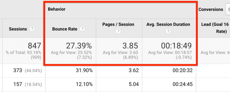
Below the sitewide numbers, the report breaks down these metrics by traffic source.
Bounce Rate
While it's helpful to know that the bounce rate is 27% sitewide, you can't really do anything with that information. You'll need to drill down by traffic source.
In the image below, you can see that the bounce rate for direct/none is 31% and for infusionsoft/email, it's 12%. So the bounce rate for people coming directly to the site is about the same as the sitewide bounce rate. The infusionsoft/email traffic, however, is about half that. The people coming to the site from email are twice as engaged as the people who are coming there directly.
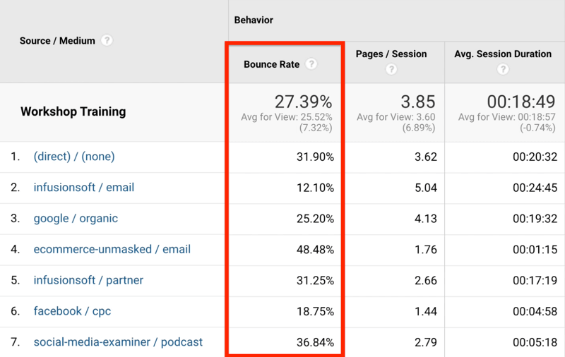
What about the other traffic sources? The bounce rate for search traffic (google/organic) is 25%, which is about the same as the overall site traffic but not as engaged as email traffic. This is about what you'd expect because these visitors probably just recently heard about the business and therefore aren't as likely to engage.
Email traffic, on the other hand, has heard about the business. They already know, like, and trust the brand and are coming back again and again. I'd expect the bounce rate to be lower because you're having a better conversation with this particular traffic source, and according to this data, it looks like that's the case.
If you look at the other email—ecommerce-unmasked/email—the bounce rate is much higher at 48%. What's the difference? They're both email so shouldn't the bounce rate be about the same?
The difference is that infusionsoft/email is an internal list. These are customers and leads so they understand the brand, are coming back to the site over and over, and are much more engaged. Ecommerce-unmasked/email, on the other hand, is people who don't know about the business yet. They're in the early stages of working with the business so a higher bounce rate is expected.
Pages per Session
Now let's move on to pages per session. Below, you can see that infusionsoft/email is at 5 pages per session, while the sitewide number is almost 4. This means visitors coming from email are seeing a lot more pages when they visit the site.
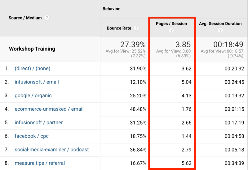
You already know that the other email source—ecommerce-unmasked/email—has a high bounce rate and looking at pages per session provides even more detail. Instead of viewing 5 pages on average per visit, these visitors are barely seeing 2. They're coming and going quickly so the targeting for this particular email may need to be adjusted.
Other traffic sources like organic have a higher bounce rate than email, but these visitors are exploring 4 pages per session on average, which is higher than the sitewide number.
This data says to your business that organic is okay. People are searching for problems, finding the site as a possible solution, and when they come to the site, some of them bounce, which is okay. But the pages per session number tells you they're sticking around and checking out a number of pages, which means they're going through the different offers and exploring the site.
So what's the conversation quality with these website visitors? It's a better conversation because the business is engaging them more. That's a good sign.
Average Session Duration
The third metric we want to look at is average session duration. In the image below, you can see that people spend about 19 minutes on average with the site for each session.
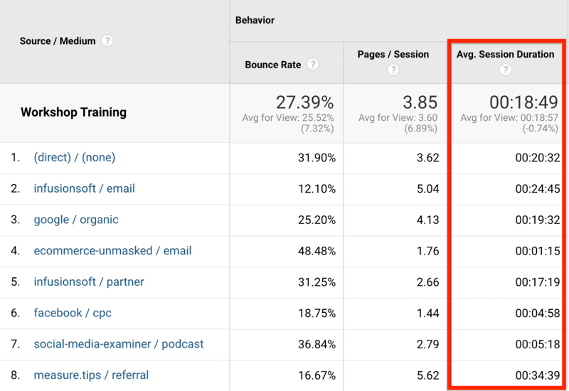
Now let's look at the different traffic sources. From the analysis above, you know that infusionsoft/email traffic is highly engaged because the bounce rate is low. Pages per session tells you that these visitors are seeing a lot of pages. And, finally, the 24 minutes on site is a lot higher than the sitewide average (18 minutes). The takeaway is that the conversation with the company's email list is good.
Looking at google/organic, you can see that these visitors are about as engaged as the average person on the site with a bounce rate that's about the same. These visitors are viewing more pages than the average, which is good, and they're spending 19 minutes on the site on average. This tells you they're taking the time to visit different pages.

Discover Proven Marketing Strategies and Tips
Want to go even deeper with your marketing? Check out the Social Media Marketing Podcast! Publishing weekly since 2012, the Social Media Marketing Podcast helps you navigate the constantly changing marketing jungle, with expert interviews from marketing pros.
But don’t let the name fool you. This show is about a lot more than just social media marketing. With over 600 episodes and millions of downloads each year, this show has been a trusted source for marketers for well over a decade.
The problem area is ecommerce-unmasked/email. These visitors are bouncing quickly and viewing fewer pages. They're looking at only a page or two, briefly checking out the content, and quickly deciding to leave.
From our analysis, it's clear that the conversation the business is having with the two different email audiences is very different. So what can you do as a marketer with that information? Look at the messaging that the ecommerce-unmasked/email traffic received and determine if it matches the expectation.
When you see numbers like this for a traffic source, it tells you people didn't find what they were looking for and didn't take the time to poke around. So go back to that traffic source and figure out what information you're giving this audience and what pages you're sending them to. Does it meet their expectation, and if not, how do you improve it?
Putting It All Together
Now that you understand how to read this Google Analytics report, let's look at two other traffic sources: Facebook CPC (which is paid traffic coming from Facebook) and traffic from a Social Media Examiner Podcast episode I was on.
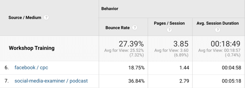
On average, Facebook CPC traffic is pretty engaged. The bounce rate is lower than the sitewide number, and when compared to the podcast traffic, it's quite a bit better. The bounce rate for the podcast traffic is a little higher than the sitewide average, telling you this audience tends to bounce more and they're not as engaged.
While the pages per session for the site is almost 4, Facebook/CPC is barely over 1. So while this traffic isn't bouncing, they're not looking around the site. And while the podcast traffic bounces a little more, they're exploring a little more. Armed with these insights, you can go back to Facebook and adjust the messaging. Also review the pages that the podcast traffic is coming back to and tweak that messaging.
In terms of session duration, both Facebook/CPC and podcast traffic are spending about 5 minutes.
So what's the story when you put all of this information together?
The story is that Facebook paid traffic is being sent to a page they like and that's the only page they like. They stick around a little to explore that one particular step but they don't go much further. They're done at that point.
And while the podcast traffic isn't as likely to engage with the page they're coming to—they bounce a little more than average—the people who do engage with that page engage with other pages as well. So they like what they find and continue the journey a bit more than the Facebook traffic does. And, of course, they stick around for about the same amount of time.
So there's a very different conversation happening with these two audiences, and again, you could go back to Facebook CPC and adjust the ad targeting or the landing pages they're sent to and improve that conversation. Ultimately, you can prove results thanks to the source/medium report in Google Analytics.
#2: Analyze Website Visitor Engagement by Landing Page in Google Analytics
Now that you understand how to use the source/medium report to understand the story of engagement, you can leverage other Google Analytics reports as well.
Let's look at one called the landing page report. To access it, go to Behavior > Site Content > Landing Pages.
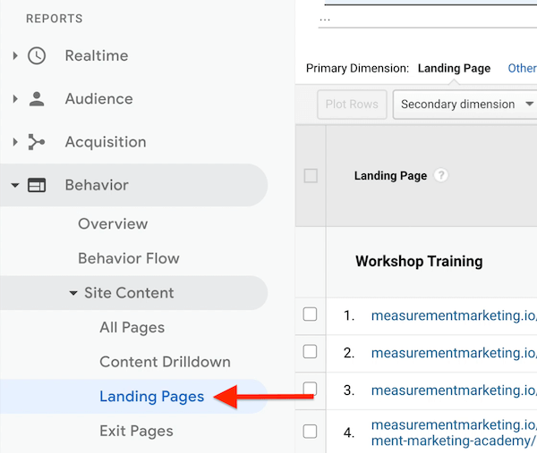
When the report opens, you'll notice it's similar to the source/medium report, but instead of learning about traffic sources, you're learning about landing pages.
Below, you can see that the sitewide numbers for bounce rate, pages per session, and average session duration are similar to what we saw earlier. The numbers below that, however, are a different story. That's because the data is broken down by landing page rather than traffic source.
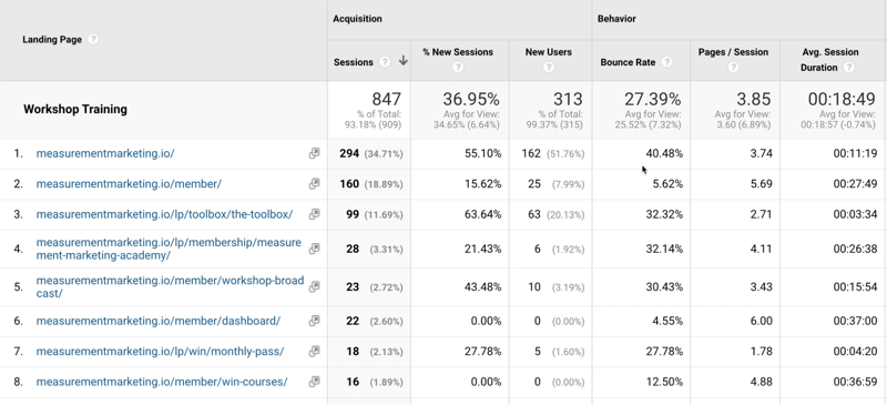
So how do you read this report?
Let's focus on two landing pages—the main home page and the member's login page.
People who come to the home page are more likely to bounce, don't view as many pages, and don't stick around as long as the sitewide average. This makes sense because the home page is a kind of directory page. It helps people find out more about the products and services provided, and if they can't find what they're looking for, they leave. So those numbers are okay.
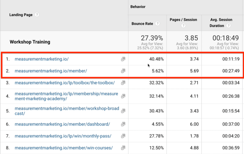
The member page is distinctly set up for existing members to log in. Notice the bounce rate's really small because what member would come to the member page without logging in? The pages per session is substantially higher because members are interacting with the membership content. The average session duration from members is almost three times as long as it is for the people who are just coming to the home page.
So you can see two different conversations the company is having based on the pages people see first in their session.
#3: Analyze Website Visitor Engagement by Device Category in Google Analytics
There's one other Google Analytics report that's similar to what we've been looking at—the device overview report. To access it, go to Audience Reports > Mobile > Overview.
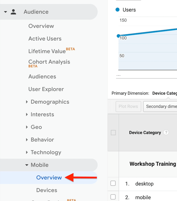
I love this report because it's short. As with the previous two reports, this one also tells you about engagement—the conversation the company is having with website visitors. The bounce rate, pages per session, and average session duration sitewide are all the same numbers we've looked at above, only this time, it's broken down by device categories—Desktop, Mobile, and Tablet.

Let's focus on desktop versus mobile. What's the story? What's the conversation the site is having with users?
You can see the bounce rate on desktop (24%) is about the same as it is for the site (27%). And mobile (40%) is almost double the bounce rate as desktop. This tells you that mobile users leave more quickly than desktop users. Pages per session with desktop is 4 but it's a little over 2 for mobile. So mobile users aren't seeing a lot of pages.
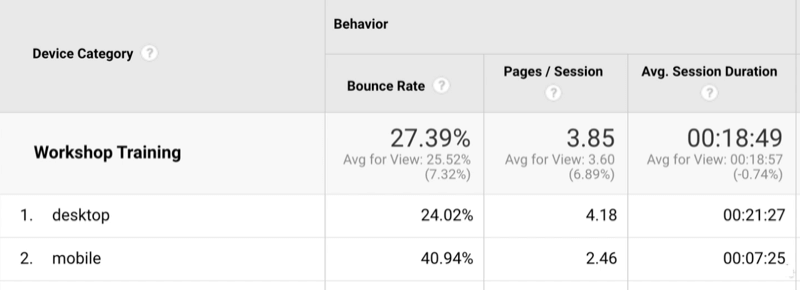
If you look at average session duration, the data continues to reveal that mobile users are having a difficult time. On desktop, the average session duration is 21 minutes so desktop users are spending time on the site. Mobile users, on the other hand, are more likely to leave, don't investigate as many pages, and don't stick around as long.
Eventually, you might want to look at members versus non-members and further segment this information. It's one of the many things that Google Analytics allows you to do. But you'll use the same skills you just developed figuring out what the engagement is—what the story is—and the conversation you're having with users.
Conclusion
The bounce rate, pages per session, and average session duration metrics in Google Analytics give you valuable insights about the people who are visiting your website. Analyze this data in the source/medium, landing page, and device reports to discover which audience segments spend the most time on your website and reveal opportunities to adjust what people see when they visit your site.
What do you think? Will you use these three Google Analytics reports to learn more about your website visitor engagement? Share your thoughts in the comments below.
More articles on Google Analytics:
- Learn how to analyze customer journey goals in Google Analytics.
- Discover how to use Standard and Enhanced Ecommerce reports in Google Analytics.
- Find out how to track awareness, completion, and engagement goals with Google Analytics.
Attention Agency Owners, Brand Marketers, and Consultants

Introducing the Marketing Agency Show–our newest podcast designed to explore the struggles of agency marketers.
Join show host and agency owner, Brooke Sellas, as she interviews agency marketers and digs deep into their biggest challenges. Explore topics like navigating rough economic times, leveraging AI, service diversification, client acquisition, and much more.
Just pull up your favorite podcast app, search for Marketing Agency Show and start listening. Or click the button below for more information.
