 by
by  Is your website meeting the needs of on-the-go mobile users?
When you're developing your first mobile site, you may be at a loss. That's understandable—a mobile website is an entirely different animal from a traditional website.
Given that, it's important to keep some best practices in mind as you develop your mobile presence.
What follows are 9 best practices you can use to ensure your mobile site is as good as it can be.
About Mobile Users
But before we dive into the 9 best practices, it's important to keep one thing in mind—the person viewing your site is mobile.
That may seem like a no-brainer, but you'd be surprised by how many people forget that simple truth.
When someone is mobile, they're expecting an entirely different experience from the one they'll get on your standard website.
For example, a mobile visitor is typically looking for a few key pieces of information: directions to your office, a click-to-call phone number or a map of your store locations. What they're not looking for are lengthy staff bios, information about your corporate philosophy or PDFs of your latest press releases.
With that in mind, let's take a look at the 9 best practices for mobile website design that can help you create a site that puts your best foot forward.
#1: Simplify. Then Simplify Again. And Again
The first step in creating a mobile site is determining what content you'll include. Given the restricted amount of screen space, it's important to figure out what key pieces of information your visitors will probably be looking for.
A store locator? Probably. A “Contact Us” form with 13 different fields to fill out? Not so much.
It's also important to keep the steps involved in going from entry point to purchase as simple as possible. Fandango does a great job of this by eliminating much of their non-essential content to quickly bring their consumers what they want: movie times.
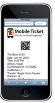
Better still, Fandango completes the sales cycle by providing a QR code that acts as a mobile ticket for the purchaser. Just bring the phone to the theater and have them scan the code there—it acts as the purchaser's ticket.
#2: Plan Your Site Layout
Mobile web pages will load slower than traditional web pages, so it's important to keep the number of pages to a minimum. In addition, users won't have the patience to click several pages deep on your site. Given that, it's important to keep the site layout as streamlined as possible.
Get World-Class Marketing Training — All Year Long!
Are you facing doubt, uncertainty, or overwhelm? The Social Media Marketing Society can help.
Each month, you’ll receive training from trusted marketing experts, covering everything from AI to organic social marketing. When you join, you’ll also get immediate access to:
- A library of 100+ marketing trainings
- A community of like-minded marketers
- Monthly online community meetups
- Relevant news and trends updates
One technique I encourage people to use is to think like Steve Jobs. As you know, Jobs is famous for creating user experiences that are streamlined and intuitive. Put on your Steve Jobs hat to remind you to keep things as streamlined as possible. By doing so, your visitors will have a better experience when they're on your site.
Domino's must have been wearing their Steve Jobs hat when they developed their mobile site (and their brilliantly designed app). Instead of creating a cluttered site with confusing options, they simplified their site and limited it to the items people would most likely be searching for.

#3: Match the Branding Elements From Your Standard Site to Your Mobile Site
Even though your mobile site will be much more streamlined than your standard site, you'll still want to incorporate the same branding elements on both sides of the equation.
This is important for two reasons. A mobile site is a brand touchpoint and, like any other property, should reflect and promote your brand essence. Also, for users who are already familiar with your company, a similar design will make them feel like they're visiting an old friend, which is an important consideration for your most loyal customers.

Discover Proven Marketing Strategies and Tips
Want to go even deeper with your marketing? Check out the Social Media Marketing Podcast! Publishing weekly since 2012, the Social Media Marketing Podcast helps you navigate the constantly changing marketing jungle, with expert interviews from marketing pros.
But don’t let the name fool you. This show is about a lot more than just social media marketing. With over 600 episodes and millions of downloads each year, this show has been a trusted source for marketers for well over a decade.
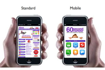
The 60 Second Marketer site uses the same bright color palette and iconography in both the standard and mobile websites. The result is that a user who is familiar with the standard site will have a similar experience on the mobile site, too.
#4: Utilize White Space
When designing any website, it's a natural tendency to cram in as much information as possible. But fight that urge. Not only does white space give a cleaner, more sophisticated appearance, it also ensures that users can easily click the button they're aiming for.
#5: Avoid Flash or Java
The obvious reason for avoiding Flash is that Apple products do not support Flash and have declared that they have no intention to do so in the future. Because iPhones make up about 30% of the smartphone market, a significant portion of your audience may not be able to access your content if you use Flash. Similarly, many phones do not support Java, and even if they do, using Java can be a huge drag on load time.
#6: Reduce the Amount of Text Entry Necessary
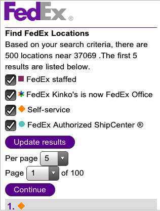
Do you suffer from fat-finger syndrome, which makes it difficult to use a smartphone keyboard? Most of us have trouble typing on tiny keyboards. When possible, use dropdown menus, checklists and pre-populated fields as a means of data entry. This helps minimize the challenges people face when typing text into a smartphone.
Take a cue from FedEx's mobile site. Even though a lot of information has to be entered into the site to accomplish the user's goal, the use of checklists and dropdown menus cuts down on the amount of text a user must enter.
#7: Do Not Use Pop-Up Windows
Navigating between multiple tabs and browser windows is more difficult on mobile and can cause slow load times. If you need to open a new browser window, make sure you alert your user so that they know how to navigate back to the original page.
#8: Use Mobile Redirects
Once your site is designed and ready to go, make sure to put redirects in place that will sniff out when a visitor is using a mobile device and direct him or her to the mobile-optimized version of the site. For a more detailed description on how to do this, check out 5 Simple Steps to Getting Started With Mobile Marketing.
Once your redirects are in place, any mobile user who types in your web address or clicks on a link in a search engine will be sent to the mobile-optimized version of your site.
#9: Allow People to Visit the Full Site
You've worked hard on your mobile site. You want people to see it and you want people to love it. But the fact of the matter is, even if you've done a good job paring down your content, there will likely be someone who wants information you've chosen not to display.
As such, make sure you include links on multiple pages that allow the user to return to the full version of the site. You can see this feature on most mobile websites including USA Today, the Geek Squad, the Home Depot and Target.

Because mobile sites are a new landscape for most marketers, designing and building them can be a bit of a challenge. However, mobile sites also bring an awesome opportunity to showcase your brand and your creativity. As long as you keep the user's needs top-of-mind, stay true to your brand and follow a few simple rules, you will have the hang of it in no time.
What are your thoughts? Have you created a mobile website for your business? What works and what doesn't? Leave your comments in the box below.
Attention Agency Owners, Brand Marketers, and Consultants

Introducing the Marketing Agency Show–our newest podcast designed to explore the struggles of agency marketers.
Join show host and agency owner, Brooke Sellas, as she interviews agency marketers and digs deep into their biggest challenges. Explore topics like navigating rough economic times, leveraging AI, service diversification, client acquisition, and much more.
Just pull up your favorite podcast app, search for Marketing Agency Show and start listening. Or click the button below for more information.
