Are you wondering how to visually enhance your Timeline Facebook page?
This article provides five actionable tips you can employ now.
The Visual Opportunity
When Facebook moved the navigation into the left column and added the Photostrip, I wrote how you could optimize your Facebook page for visual branding.
And when Timeline was rolled out for personal profiles, I also wrote how you can customize your cover photo and profile picture.
With each new overhaul of Facebook pages, there have been increased opportunities for brands to use imagery to better promote their offerings and create visual interest, and Timeline for pages is no different.
Establishing a consistent look and feel across pages and personal profiles, Timeline for pages provides significantly more opportunities to create a visually compelling page, starting with the masthead.
In this article, I focus on five key areas where imagery can be used most effectively:
- Cover photo
- Profile picture
- Custom tab images
- Highlighting posts
- Milestones
#1: The Cover Photo: Your Biggest Branding Opportunity
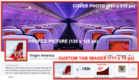
The most visually significant change in Timeline for pages is the addition of the cover photo, an 851 x 315 pixel area where you can upload a single image.
In creating your cover photo image, Facebook advises:
- Use a unique image that represents your page. This might be a photo of a popular menu item, album artwork or a picture of people using your product. Be creative and experiment with images your audience responds well to.
- Use the cover photo to bring a strong visual impact to your page by extending your brand with lifestyle imagery, product images or a description of your services.
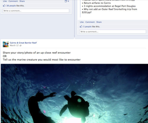
For examples, see the Cairns & Great Barrier Reef cover photo (and profile picture):

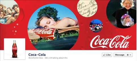
Coca-Cola cover photo (and profile picture):
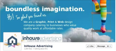
Inhouse Advertising cover photo (and profile picture):
What Facebook DOESN'T Want You to Do With Your Cover Photo
Facebook has strict guidelines about the cover photo:
Get World-Class Marketing Training — All Year Long!
Are you facing doubt, uncertainty, or overwhelm? The Social Media Marketing Society can help.
Each month, you’ll receive training from trusted marketing experts, covering everything from AI to organic social marketing. When you join, you’ll also get immediate access to:
- A library of 100+ marketing trainings
- A community of like-minded marketers
- Monthly online community meetups
- Relevant news and trends updates
- No promotions, coupons or advertisements
- It shouldn't be primarily text-based or infringe on anyone else's copyright
- No price or purchase information, such as “40% off” or “Download it at our website”
- No contact information, such as web address, email, mailing address or other information intended for your page's About section
- No references to user interface elements, such as Like or Share, or any other Facebook site features
- No calls to action, such as “Get it now” or “Tell your friends”
I strongly advise you to adhere to the above guidelines. Facebook doesn't state what it will do if your cover photo doesn't follow the rules, but I wouldn't want to risk finding out!
#2: The Profile Picture: The Hardest-Working Image on Facebook
In the previous page format, the profile picture was your page's “hero” image, a 280 x 540 pixel area in the upper-left corner of your page.
What Facebook still calls the “profile picture” is now a 125-pixel square image that is inset into your cover photo in the lower-left area. The profile picture now does triple duty:
It's important to take all three contexts into account when creating your profile picture graphic, making sure the image works nicely with the cover photo, as your brand's 50 x 50 pixel icon accompanying page posts, and on the Facebook mobile app.
Here are some fine profile picture examples:
Ben & Jerry's profile picture integrates nicely with the cover photo, and makes a great thumbnail icon.

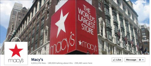
The Macy's page both integrates well with the cover photo (check out how they turn the square white profile picture into a Macy's bag) and works as a well-branded thumbnail image.
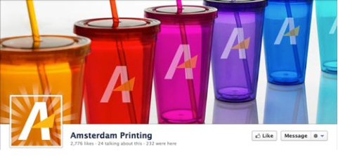
The Amsterdam Printing page does an excellent job of integrating the profile picture so that it extends the cover photo, and provides a great brand icon.
The Old Spice profile picture appears to be semi-transparent with the volcano extending into it.
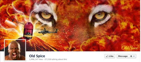
A clever integration of your cover photo and profile picture is the challenge. For a detailed tutorial on how to more easily achieve an effect similar to what Old Spice, Amsterdam Printing or Macy's Pages do, read my tutorial.
NOTE: Although the profile picture is displayed at 125 x 125 pixels, Facebook requires that the image you upload be 180 x 180 pixels, which it then resizes. And, of course, make sure your profile picture graphic is a square.
#3: Custom Tab Images: Make Sure You Take Advantage of These
This is one of the major improvements of Timeline for pages. Facebook has moved the navigation to your Facebook and custom tabs back to the top, below the cover photo. Where before you had your navigation as tiny 16 x 16 pixel icons with the tab name in the left column, now you have a maximum of four tabs prominently displayed at 111 x 74 pixels PLUS the tab name below the image.
Here are a few important things to keep in mind about the custom image tabs:
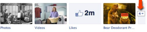
- You can't change or reposition the “Photos” tab (which displays the most recently uploaded image).
- You can display a maximum of four tabs (including the Photos tab). Your remaining tabs are displayed when the user clicks the “arrow” icon to the right of the tab images.
- If you opt for fewer than four displayed tabs, the “About” info occupies the extra space.
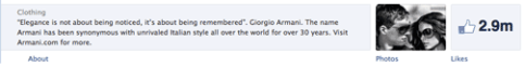
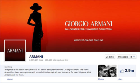
Armani has only two tabs displayed. 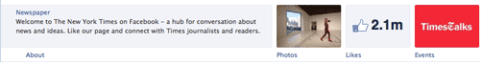
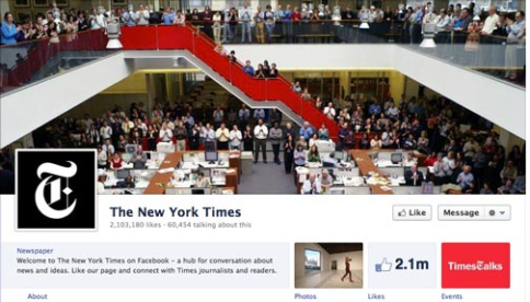
The New York Times displays three tabs. - You can create your own graphics for any custom tab images EXCEPT Facebook's own apps (Photos, Notes, Events, Videos, Links).
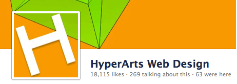
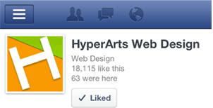
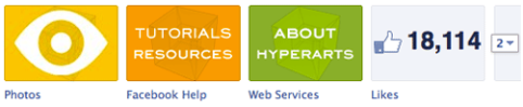
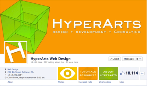
TIP: Use the messaging in your custom tab image in conjunction with the tab's title that displays below the Image. For example, on the HyperArts Timeline page, the custom image tabs and tab names reinforce each other.

Discover Proven Marketing Strategies and Tips
Want to go even deeper with your marketing? Check out the Social Media Marketing Podcast! Publishing weekly since 2012, the Social Media Marketing Podcast helps you navigate the constantly changing marketing jungle, with expert interviews from marketing pros.
But don’t let the name fool you. This show is about a lot more than just social media marketing. With over 600 episodes and millions of downloads each year, this show has been a trusted source for marketers for well over a decade.
How to Customize the Custom Tab Images
To edit your tab images, just click the arrow to the left of the three or four images.
IMPORTANT: Page admins will see ALL of their tabs revealed by clicking the arrow. Other users will see a maximum of 12 tabs (including Photos), with 4 displayed and 8 hidden.
Next, mouse over the custom tab image you wish to change, and click the “pencil” icon that appears in the top-right corner and select “Edit Settings” from the contextual menu.
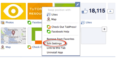
In the pop-up dialog, click “Change”.
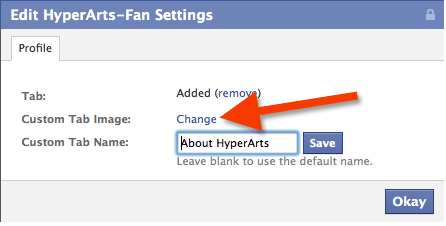
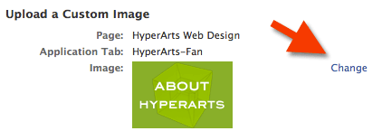
Click “Change” to select and upload a new image.
Click the “Okay” button. Done!
Create Your Custom Tab Images to Fit Your Overall Branding
Make sure you pay attention to how all the graphic elements in your Timeline masthead work together to form a unified whole. You can even “control” what the Photos tab image is by reuploading the image you want there after any other images are uploaded. This is a bit obsessive, but it's within your power!
Besides opting to display only three tabs, the New York Times has a cool correspondence between the red stairs and the “TimesTalks” custom tab image.
On the HyperArts fan page, I went for the fully integrated, obsessive approach.
The Armani page goes minimal, and I like it. Notice they opt for only two tabs, keeping it simple.
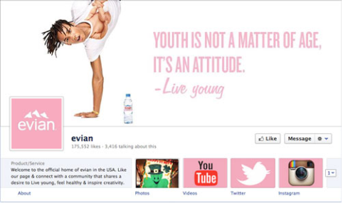
The Evian page creates a very nice unified branding with a clean design and consistent pink/white palette.
On the American Express page, we see visually unified, icon-based custom tab images.
Strive to achieve a unified, compelling and eye-catching effect on your Timeline page masthead.
#4: Highlighting Posts to Create Visual Interest
Many users and page admins have found Timeline's new way of displaying user and page posts cluttered, confusing and counterintuitive. Where before users could view all posts—by the page or by other users—in a chronological sequence, in the new Timeline format this sequence is broken up and often hard to follow.
However, page admins can use the new “highlight” feature to bring a bit of order to the chaos!
Use the Highlight Feature to Create Visual Organization
You can highlight any page status by clicking the “star” icon that appears in the top-right area when you mouse over one of your updates. (To remove the highlight on a status, just click the Highlight star again.)
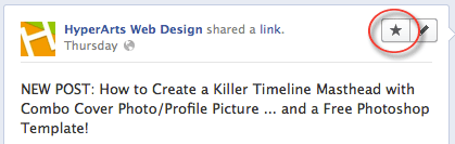
When you highlight a page status, it then occupies two columns in your Timeline, breaking up the monotony of the two columns as well as attracting more attention to that particular status.
Tip #1: If you want each month more clearly delineated visually, you can edit the date of a highlighted status so that it appears first or anywhere in the chronology you want it to appear.
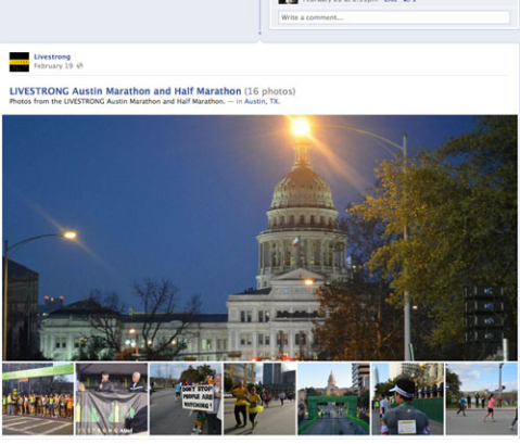
Tip #2: If your status update includes a Photo Album, the update will display the first image and include below it a row of thumbnails of the other pictures in the album, as you can see on the Livestrong page.
Highlighting is a great way to combat the visual chaos of Timeline's layout.
#5: Create Milestones to Make Your Page “Sticky”
Another way to break up the two-column layout and create a more compelling experience is to use the new “Milestones” feature.
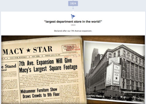
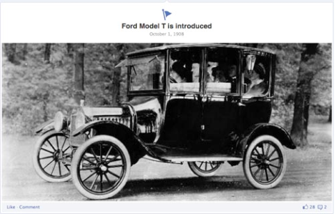
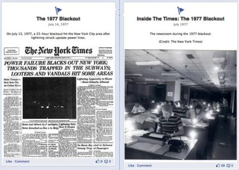
Brands can create Milestones—incorporating pictures and text—for various significant events in their histories. Check out how the Macy's Page and the Ford Page use Milestones to visually organize their content and keep users on the Page with great archival photos.
And The New York Times Page has a wealth of content from which to create Milestones, in both one- and two-column formats.
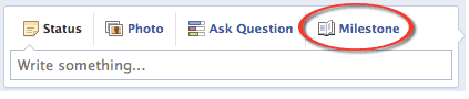
How to Create a Milestone on Your Timeline Page
To create your first Milestone, just click on the “Milestone” option where you create status updates.
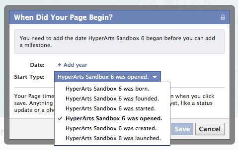
Before you can create Milestones, you have to establish a benchmark date—birth year, company started, company founded, etc. Facebook makes this easy by displaying a pop-up dialog the first time you click the “Milestone” link.
Once you establish an inception date, you can then create Milestones. Of course, I encourage you to utilize imagery in your Milestones and create as many as you want, the more the merrier!
The takeaway: Imagery takes center stage in timeline!
As you can see from the above examples, the new Timeline for pages format provides far more opportunities for visually branding your page. It's up to you to take advantage of these opportunities.
What do you think? What have you learned through your experience transitioning your business to Timelines? Leave your questions and comments in the box below.
Attention Agency Owners, Brand Marketers, and Consultants

Introducing the Marketing Agency Show–our newest podcast designed to explore the struggles of agency marketers.
Join show host and agency owner, Brooke Sellas, as she interviews agency marketers and digs deep into their biggest challenges. Explore topics like navigating rough economic times, leveraging AI, service diversification, client acquisition, and much more.
Just pull up your favorite podcast app, search for Marketing Agency Show and start listening. Or click the button below for more information.