 by
by  Are more of your blog visitors coming from a mobile device instead of a desktop computer?
Do you wonder how responsive design can increase customer satisfaction and improve your marketing?
In this article I'll explore three ways incorporating responsive web design into your online strategy can benefit your business.
What is Responsive Design?
Responsive web design means that your blog or website will automatically appear properly formatted on any device: a desktop computer, a tablet or a mobile device.
In What Users Want Most from Mobile Sites Today, Google reports that 61% of mobile visitors who click through to a non–mobile-friendly website will return to Google to find a site that's more easily readable from their device. It's become critical for companies to have a responsive design for their sites.
Let's explore how responsive design can help your business:
#1: Obtain Higher Conversion Rates With an Easy Mobile Experience
In the same Google report I mentioned above, 78% of users want to find what they're looking for on a mobile site in just one or two clicks, and 64% of users only want to scroll up and down on a business' mobile site, not left and right.
Why is this important for you, as a marketer who sells products online?
If mobile users come to your website and see that they have to zoom in to find everything they need and constantly scroll from left to right and up and down to browse pages, they're most likely going back to Google to find another website that is mobile-friendly.
However, if your website is easy to use, they'll be able to access the information they're looking for and make purchases quickly.
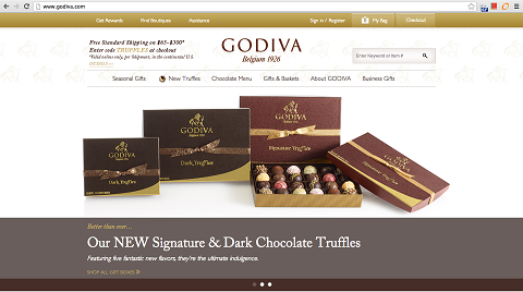
For example, let's look at Godiva. This is their website as viewed from a desktop or laptop computer:
This is Godiva's website as viewed from a mobile device.
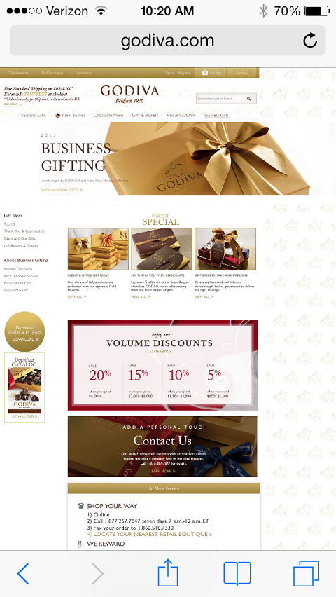
To buy some chocolate from Godiva, you have to zoom in, scroll to the left, click one of the options on the toolbar and click an item from the dropdown. And you're still nowhere nearer to buying chocolate!
When you get to the next page, you have to do it all over again, because the website isn't responsive.
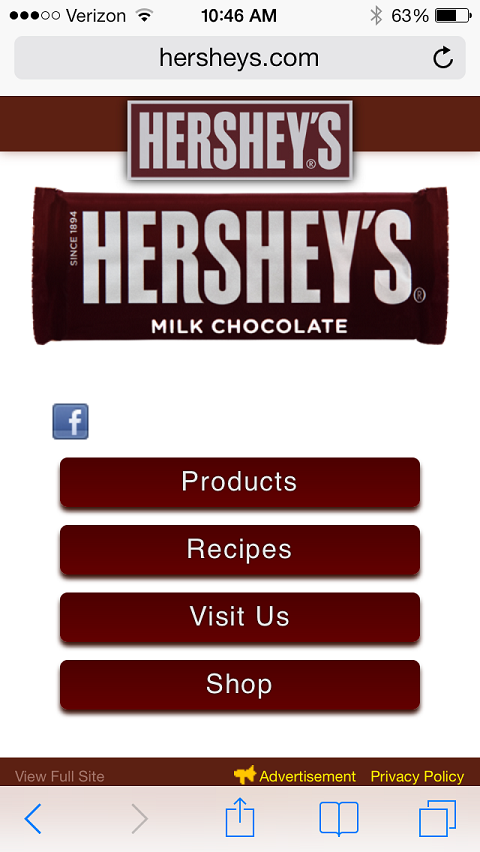
Now let's take a look at Hershey's. Their responsive website allows potential customers to purchase products in a few simple clicks.
Which AI Moves Actually Matter?
That's what every marketer is wrestling with now. New AI strategies, new tools, new takes every week — but no clarity. Most marketers and business owners are trying to figure out AI alone.The AI Business Society is your trusted guide. Get expert-led training you can put to work immediately. Plus a community of marketers sharing what's actually working.
I'M READY FOR REAL AI RESULTS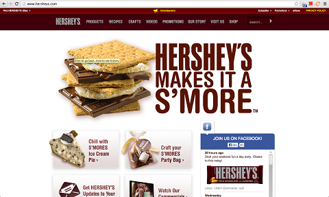
When mobile users go to a website, they expect to be able to access links just as easily as if they were on their desktops.
3 Days of World-Class Training—Zero Travel!

Couldn't make it to Social Media Marketing World and AI Business World this year? Get all of the great content at a fraction of the price with a Virtual ticket.
That’s full access to recordings of every keynote, workshop, and session—the ones people travel thousands of miles to see. Don't wait. Get your Virtual ticket and enjoy actionable content that you can watch anytime, anywhere.
Hershey's mobile website experience is comparable to that on a computer. And what does that mean? A much higher conversion rate.
#2: Attract Customers as They're On The Go
Not all websites are looking for a lot of online purchase conversions from their mobile site. Instead, they may rely on a ton of traffic from the site to drive brick-and-mortar location purchases.
For example, take Hubway, a bike-sharing company. A lot of people walking around see bikes that say “Hubway” on the side and wonder what it's all about. They don't have their laptops with them when they're outside, but the chances are pretty good they've got a phone in their pocket.
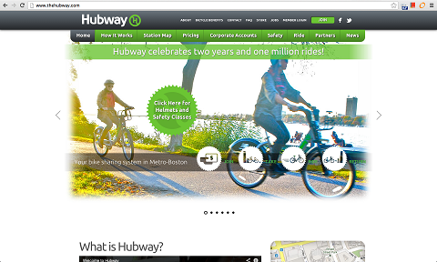
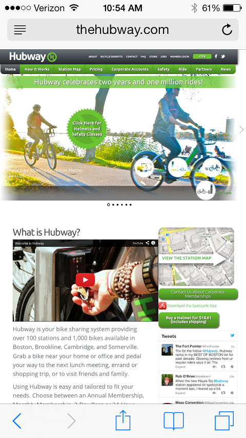
Unfortunately, Hubway's website isn't responsive, so a number of would-be customers are likely frustrated with the jumbled display and click out of the site before they even learn how or where to rent a bike.
If you look up Citi Bike from a phone, the responsive site immediately shows you how to access pricing, how the program works and how to get more information with one click.
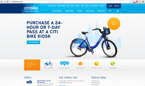
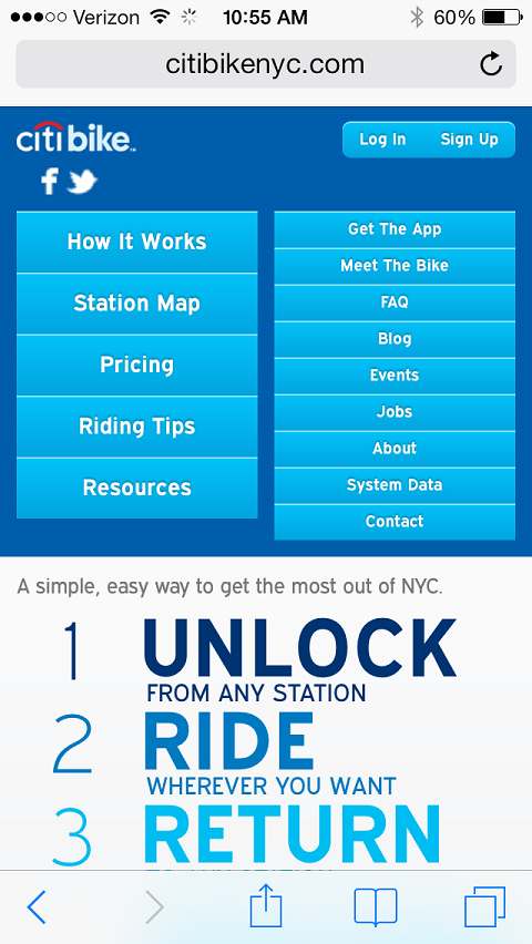
On Citi Bike's mobile website, users can access links just as easily as if they were on their desktops.
Responsive design lets you give your on-the-go visitors a better user experience and decreases the likelihood that they will leave your website in search of something easier to navigate.
#3: Manage Multiple Displays With a Single Edit
Imagine the number of hours it would take you to update different versions of your website for mobile, tablets and desktops. Whether you're publishing a blog post or updating a web page, you don't want to have to do the same task multiple times.
With responsive design, you update your website with an edit once, and the changes automatically translate onto the mobile, tablet and desktop versions.
Responsive design actually saves you valuable time that you can use for the many other responsibilities you have.
How to Make Your Site Responsive
Now that you understand the importance of responsive design for your marketing efforts, let's discuss ways that you can make your site responsive.
First, you can always hire a developer or designer to make the changes in the code to make your website responsive. The complexity of your site will determine how long it will take, but it will be worth it to increase your conversion rate.
Another option is to use a responsive theme, which you can find from all of the premium theme providers.
Over to You
Responsive design is beneficial for conversion rates and usability, and the amount of time it saves marketers and designers is astronomical. But its greatest strength is the difference it can make to a customer who's viewing your site from a mobile device.
What do you think? What other benefits do you see in responsive design? Please leave your questions and comments in the box below.

Curious About How to Use AI?
Our newest show, AI Explored, might be just what you're looking for. It's for marketers, creators, and entrepreneurs who want to understand how to use AI in their business.
It's hosted by Michael Stelzner and explores this exciting new frontier in easy-to-understand terms.
Pull up your favorite podcast app and search for AI Explored. Or click the button below for more information.