 Do you have a strong visual presence on your social channels?
Do you want to build better online brand recognition?
Using consistent visual design elements in your social media marketing efforts helps people recognize your updates.
In this article, you'll discover how using consistent colors, fonts and photo filters sets your brand up for social media success.
Why Visual Branding Is Important
There's a secret that successful companies know about social media: A strong visual brand helps you connect with your community and effectively convey your brand's personality. In short, it makes you memorable. Like Twizzlers.

Content calendars, brand personalities and tone-of-voice guides have become all the rage in social media circles, but visual social branding—the way your content looks—is still in its infancy.
Good branding doesn't have to be complicated. In this article I talk about the essential aspects of visual branding, and luckily, each one is easy to create and implement! Let's dive in.
#1: Set Your Color Palette
Does your company have specific colors associated with it?
If not, I encourage you to think about your brand’s personality and how you can convey it with color; a strong color palette is a key element of brand recognition.
Are you a fun brand that wants to inspire creativity? Use bright or pastel colors. Or are you an insurance brand built on trust? Use trustworthy dark blues and maroons.
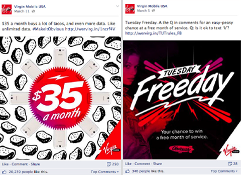
Both Google and Virgin Mobile are examples of successful companies using established brand colors.
Google‘s color scheme is immediately recognizable and is used in all of the company's imagery. The colors (primary red, blue, yellow and green), as well as their images, reflect Google's playful, innovative culture.

Virgin Mobile also does a great job when it comes to reflecting its brand uniformly on social media. All of its social posts adhere to the same color palette and are consistent with the company's website and other promotional material such as physical store signage, email marketing and television advertising.
Get World-Class Marketing Training — All Year Long!
Are you facing doubt, uncertainty, or overwhelm? The Social Media Marketing Society can help.
Each month, you’ll receive training from trusted marketing experts, covering everything from AI to organic social marketing. When you join, you’ll also get immediate access to:
- A library of 100+ marketing trainings
- A community of like-minded marketers
- Monthly online community meetups
- Relevant news and trends updates

If you want to be sure you're using the same colors throughout your marketing materials, write down the hex codes so you have them handy any time you need to create graphics. It's a good idea to share the codes with your team.
#2: Determine Your Brand Fonts
Like your color palette, your font choice should reflect your brand's personality. Don't go crazy. You only need two to three fonts. Any more than that and your audience may be distracted and your message lost.
The 1 Million Women Facebook page combines a fun, modern font with images for its posts. Using the same font for each post trains their audience to recognize the company's Facebook updates in the news feed, which in turn encourages more interaction.

Do you have a font you use regularly on your social media posts? If not, pick two to three that represent your brand and incorporate them into your marketing efforts.

Discover Proven Marketing Strategies and Tips
Want to go even deeper with your marketing? Check out the Social Media Marketing Podcast! Publishing weekly since 2012, the Social Media Marketing Podcast helps you navigate the constantly changing marketing jungle, with expert interviews from marketing pros.
But don’t let the name fool you. This show is about a lot more than just social media marketing. With over 600 episodes and millions of downloads each year, this show has been a trusted source for marketers for well over a decade.
#3: Use Photo Filters
Color palettes and fonts may be things you already have in place, but have you considered adding a consistent look and feel to your photos?
Using the right filter for all or most of your pictures can reinforce your brand’s culture and personality and may even make your posts more recognizable in the news feed.

The first step in picking out your photo filter is to decide which effects work best with your existing design elements (e.g., color palette and fonts). Think about what kind of message you'd like your images to convey. Are you sunny and bright, cool and urban or colorful and fresh?
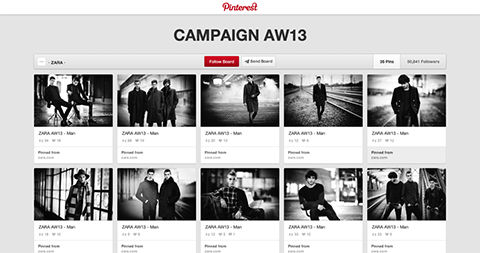
In their Autumn/Winter campaign, fashion retailer Zara bumped up their images with high contrast and a heavy vignette to achieve this classy black-and-white effect. Easy to replicate, this photo effect is a good one for demonstrating sophistication and a cool urban vibe.

Now, of course, no two brands are the same, and a filter that suits one brand won't necessarily suit another.
Unlike Zara, fashion brand Tigerlily offers a whimsical charm in its imagery. The company uses a filter that quickly conveys the company's personality.

Is there a photo filter that would work well with your brand? Consider using one to bring a consistent look and feel to the photos you share on your social media sites.
#4: Design Consistent Templates
Now that you have your colors, fonts and filters (as appropriate), you want to be sure to use them together every time you create new marketing materials (even if that material is just a Facebook, Pinterest or Google+ post).
Oreo is one of the best-known examples of how templates can be used to great effect on social media.
In 2012, the company updated its Facebook page with a new image each day for 100 days. Labeled as The Daily Twist, the brand took a pop-culture reference and imagined it through the Oreo brand.
In the image below, you can see that Oreo created a specific template for the campaign. Each Facebook post included the brand's color palette and font, an Oreo cookie design, the date, a title and a logo.

These consistent elements tied each post together and made the campaign easily recognizable.
Take the time to create templates for quotes, announcements, sale products, promotions or competitions. They'll make it easy for you and your team to quickly create and post timely content. And they'll also make it easier for your social media fans to recognize your brand and encourage further engagement.
Some Parting Thoughts
The key to social media is building a relationship with your audience. Increase that relationship by promoting familiarity through branding.
When you use colors, fonts and filters consistently, your fans and followers come to recognize your brand quickly and your content stands out in their social feeds.
Set aside some time to review your company's online image. If you take away your company's name, will your fans still know it was you posting? If not, look at ways you can implement the ideas in this article.
What do you think? Have you tried any of these techniques on your social media pages? Do you have additional tips? Share your tips and designs below!
Attention Agency Owners, Brand Marketers, and Consultants

Introducing the Marketing Agency Show–our newest podcast designed to explore the struggles of agency marketers.
Join show host and agency owner, Brooke Sellas, as she interviews agency marketers and digs deep into their biggest challenges. Explore topics like navigating rough economic times, leveraging AI, service diversification, client acquisition, and much more.
Just pull up your favorite podcast app, search for Marketing Agency Show and start listening. Or click the button below for more information.

