 Does your business have a blog? Are you looking to generate engaging comments and new daily visitors? If so, look no further.
This article showcases 10 top blogs in multiple markets. Follow their lead to take your blog from good to great. And if you don’t have a business blog yet, now’s the perfect time to get in the game!
Each of these successful blog examples has incorporated unique features that have attracted thousands of readers. The great news is that you don’t have to reinvent the wheel—just model the best. Take a look at these thriving blogs and apply the same success strategies to your own blog.
#1: Sweet Leaf Tea
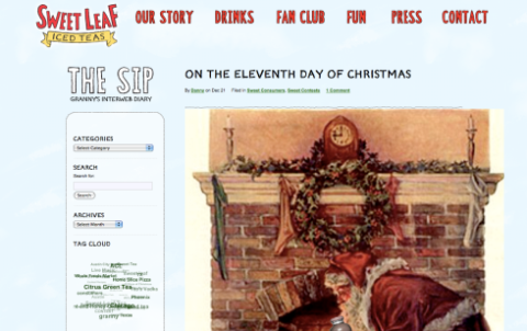
Sweet Leaf Tea is a blog site that sells specialty teas. They’ve figured out a way to humanize their blog while staying true to their brand. Sweet Leaf Tea uses their blog design to bring a less formal, more human touch to their brand.
Notice in the image below the casual fonts, the old-world feeling of their images and the informal language they use to spotlight the features on the site. It’s more “people-speak” than “marketing-speak” and this strategy instantly draws in their target audience.
Sweet Leaf Tea also showcases their employees in a very friendly, casual way. They show photos of their teammates (they call them “Tea Mates”) and give us a behind-the-scenes glimpse of their fun work environment by posting the Tea Mates’ nicknames and interests.
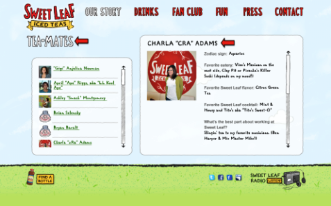
Tip: Consider allowing your employees to be the face of your brand. Highlighting your team is a great way to bring your readers behind the scenes and let them see the team camaraderie. This kind of transparency builds trust with your readers. Also, your team can help you keep things informal, fun and relatable. It’s important to be professional, but remember your readers are human and everyone enjoys a little fun too.
#2: Stonyfield Farm
Stonyfield Farms specializes in organic dairy products. Their branding is geared toward family, farming and living an organic lifestyle.
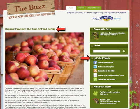
Stonyfield does a great job of staying true to their brand by creating a targeted theme within their blog. As you can see from the image below, they use a barnyard as their home page backdrop, and include pictures of healthy families and articles about healthy living. All of these components reinforce their theme of family and healthy living. Plus, notice how they say “Let’s Be Friends,” a much friendlier, warmer way to encourage people to connect with you on your social sites.
They also use video in a very genuine, behind-the-scenes kind of way. Just like their blog’s theme of family and farming, their videos are not professionally done, but with real people living the lifestyle they personify. Many of their videos come from the farm of an organic dairy farmer in Vermont, who supplies milk for their products. You can’t get much more behind-the-scenes than that!

Get World-Class Marketing Training — All Year Long!
Are you facing doubt, uncertainty, or overwhelm? The Social Media Marketing Society can help.
Each month, you’ll receive training from trusted marketing experts, covering everything from AI to organic social marketing. When you join, you’ll also get immediate access to:
- A library of 100+ marketing trainings
- A community of like-minded marketers
- Monthly online community meetups
- Relevant news and trends updates
Staying true to your theme, as Stonyfield has done with their videos, allows your audience to know, like and trust you. This is key to building a solid blogging foundation.
Another thing they do very well is their use of soft sales messages contextualized in value-added content. For example, they may write an article about the importance of eating organic fruit, but weave in the idea of mixing Stonyfield yogurt in with your fruit for an extra dose of nutrients. There’s nothing wrong with promoting your products on your blog; just remember that the most successful blogs place added value before selling.
The Stonyfield Farm blog is a great example of a big brand using their blog to build community and educate their readers about their market.
Tip: Try to weave in a theme throughout your blog. To help with this, consider inviting outsiders to contribute to your blog. Another great tip is to go deeper by allowing your audience to see what’s behind the curtain. Behind-the-scenes stories and footage invite the reader in even more and will help you create content that stays true to your theme.
#3: Pioneer Woman
Pioneer Woman is an excellent example of a successful lifestyle blog. The blog’s creator, Ree Drummond, has used her blog as a platform for a variety of projects, including promoting her cookbook and showcasing her photography. Her “secret sauce” lies in her ability to connect personally with her readers while creating a welcoming, friendly and warm experience one blog post at a time.
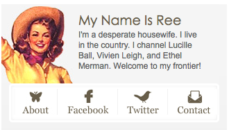
One great example of Ree’s welcoming persona is her simple bio on the home page. And take a look at her social sites. They’re easy to see and are also uniquely designed to match her site. This is smart branding at its best!
Another way Ree is consistent with her branding is in her blog’s header. She changes it depending on the season and time of year. Because so much of country life is about holiday and seasons, this small touch is directly aligned with the overall vision of the blog. Also notice her brilliant use of photography. Photos on a blog are essential when you want to create a feeling or experience for your readers.
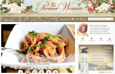
In addition, her blog layout is easy to navigate, which is extremely important considering the short attention span of most readers today. Ree has added icons that allow you to view her blog in multiple ways, including multiple blog thumbnails to a page or just a few at a time. You get to decide. These small touches are just some of the reasons her readers continually return for more.
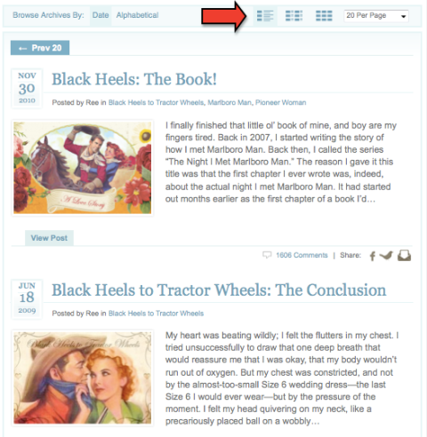
Tip: Be aware of your brand when you’re designing your blog. Consider using photographs and brand-specific design elements to draw in your readers. By increasing your blog aesthetics, you can easily create a more personable and relatable experience for your readers.
#4: Citrix
Citrix’s unique blogging strategy is all about adding value. Their blog, Work Shifting, is a work/lifestyle blog that focuses on the issues people in business experience when on the move. What’s interesting is that you have to really look hard to know which company is behind the blog because Citrix downplays their involvement. Instead, they’ve put their audience’s needs first and have created a space that resonates with their audience’s needs and interests.
In addition, to set their blog apart from the rest, they use distinct visual branding with their logo and images. Plus, their visual branding is memorable—another surefire sign of a successful blog. In addition to their branding, notice below how the content and topics are all about the target audience’s needs. This is key when creating a blog that’s bigger than your own brand.
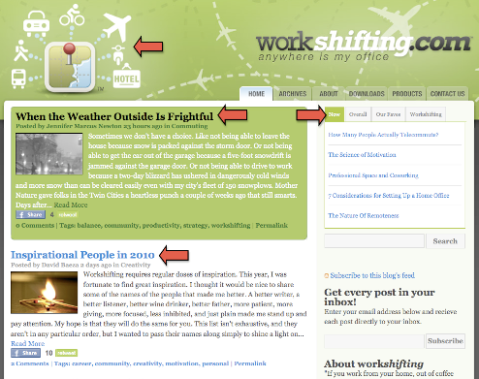
They also use a broad range of contributors—people who do not actually work for Citrix. This is a smart strategy to diversify the content of your blog and attract new readers via those who already follow your contributors.
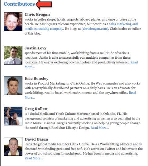
Tip: Focus on adding value to a market that’s bigger than your brand. You can do this by collaborating with contributors who are experts in your market and who will resonate with your ideal audience. Offer as much free value as possible and keep your sales messages as low-key as possible to keep the focus on the content. This strategy will build trust with your target audience and keep your readers coming back for more.
#5: Danny Brown
Danny Brown’s blog is a terrific case study for consultants or anyone with a personal brand. This site positions Brown as an expert in his field and showcases his expertise, knowledge and services.
A brilliant feature on this blog is the way Danny presents his consulting services without being too pushy or arrogant. It’s all about the language he uses. Instead of saying “Hire Me” on his site, he instead uses the phrase “Work with Me.” It’s a subtle shift in language, but conjures up an entirely different experience.
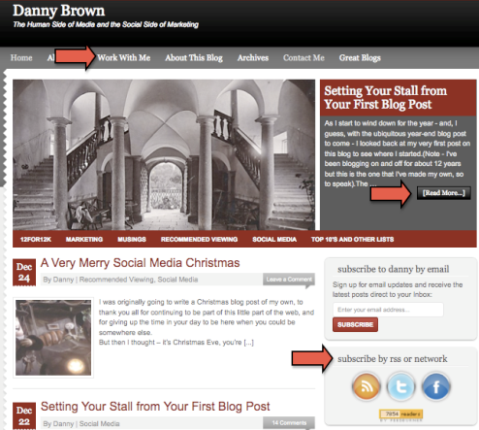
 In the image above, you’ll also see that Danny uses the cliffhanger concept by posting a snippet of a blog post and then adding a “read more” button to get the reader to dive deeper into his blog site. This is a powerful way to get people’s attention and entice them to stay a little longer and explore your site. Also, this concept helps you save space on your home site by just giving a teaser of your article content.
Discover Proven Marketing Strategies and Tips
Want to go even deeper with your marketing? Check out the Social Media Marketing Podcast! Publishing weekly since 2012, the Social Media Marketing Podcast helps you navigate the constantly changing marketing jungle, with expert interviews from marketing pros.
But don’t let the name fool you. This show is about a lot more than just social media marketing. With over 600 episodes and millions of downloads each year, this show has been a trusted source for marketers for well over a decade.
One of my favorite features on his blog is the share sidebar next to his blog posts. The WordPress plugin is called Digg Digg and the sidebar floats on the screen. When a reader scrolls down the page, the sidebar follows them. This is a smart way to make it as easy as possible for people to share your content.
Tip: Make content sharing on your site as easy as possible for your readers. If they have to look around for the share features, they’ll likely skip sharing altogether. Consider using the Digg Digg plugin to make this possible on your site.
#6: Ecoki
Ecoki is a blog site that offers a wide range of articles, tips and ideas on everything related to living a green lifestyle.
The beauty of this blog is the clean, grid-based template. This style makes it easy to read and showcases the various topics. In addition, they make it simple to navigate the site by adding easily visible headers, such as featured article, latest news, popular items and resources. Sometimes just calling out the specific areas on your site is all you need to do to get people more engaged with your content.
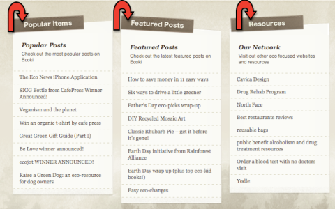
In addition, Ecoki has two types of navigation bars. The top navigation bar calls out the main topics they cover, including food, technology and design, and the navigation directly under it showcases their media delivery, including articles, video and info on contributors. These two different navigation bars give more power to the readers by allowing them to choose how they want to consume the content.
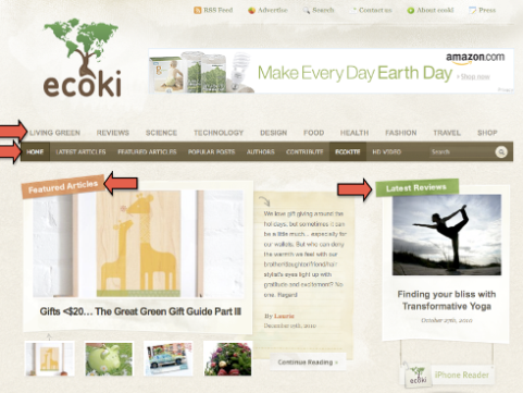
Tip: If the content for your blog site includes multiple topics, consider the grid layout design. It’s easy to follow and allows you to showcase multiple areas in a simple format. Also, one smart strategy is to add in photos to break up the text in your grid layout and make the site more inviting and less static.
#7: Nuts About Southwest
Southwest Airline’s blog, Nuts About Southwest, is one of the most popular airline blogs around today. Their secret to success is they understand their loyal flyers’ needs and interests and capitalize on that throughout their blog. The blog is designed to build a relationship between the brand and their consumers.
One thing to remember is that blogs are so much more than just text. What Southwest does best is mix up their media. They use written articles, videos, photos, polls and surveys to capture the interest of their many readers. They often lead with images to draw in the reader, a great strategy for any business blog.
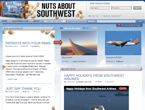
In addition, Nuts About Southwest has added a feature where returning readers can create an account to customize their profile and engage with other Southwest readers. Since frequent flyers are often loyal fans, they’re likely to exchange travel stories and experiences with other readers. Southwest created a way to make this easy for their readers.
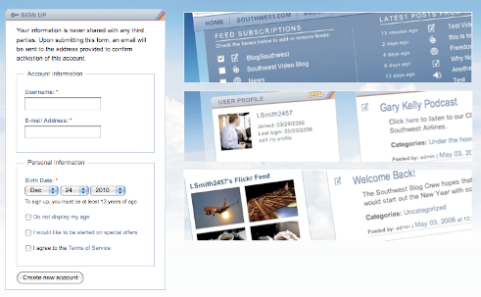
Tip: Special features on your blog are a great strategy, especially if you have loyal fans who will likely return to your blog on a regular basis. (After all, this is the goal for most blogs, right?) Treat your returning readers as VIPs by creating features and content that facilitate engagement with you and other readers.
#8: Disney Parks
Disney Parks is a site designed to encourage more visitors to Disney’s parks. They do a fantastic job of making their site memorable and useful.
One great feature is the way they showcase their blog authors. Next to each post is a photo of the author. This allows their content to be a bit more friendly and transparent.
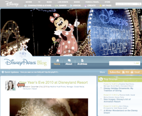
Also, Disney is a world-renowned company and they’re known for their professional branding and impeccable productions. To be consistent with the branding and to meet the expectations of their audience, this blog site posts professional videos, photos and content. Unlike the Stonyfield Farms blog mentioned earlier, Disney Parks does not have that casual, homegrown feeling to it. Instead it’s polished and professional to match their branding.
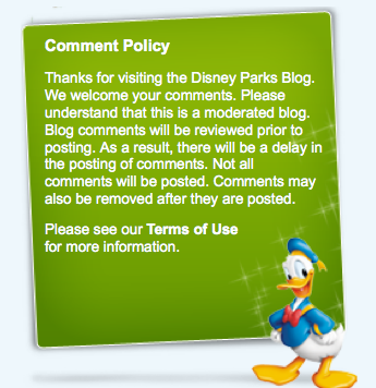
This blog site also includes a comment policy to inform their readers that comments are monitored. Because they’re appealing to families with children, Disney Parks needs to make sure parents feel safe when their children visit the site.
Tip: Keep your design simple while staying true to your audience’s expectations. If you have a polished, professional image, don’t stray too far from this on your business blog. The key here is to know your audience’s expectations and go above and beyond to deliver what they want to read, see and experience most.
#9: Procter & Gamble
Man of the House, a Procter & Gamble blog, is a great example of a blog that targets a very specific audience. The blog is designed specifically for men and covers all areas that interest men, including money, career, technology, family and fitness. Although there are many “mommy blogs” out there today, there are very few sites that focus solely on men and their interests. This site captures that niche market perfectly.
They do many things right, but one great feature is their use of photos on their home page. Each blog post includes a thumbnail photo above each post to allow their readers to browse the articles easily. This is a great way to showcase your content, especially if you’re writing on a variety of topics and want your audience to browse your archives.
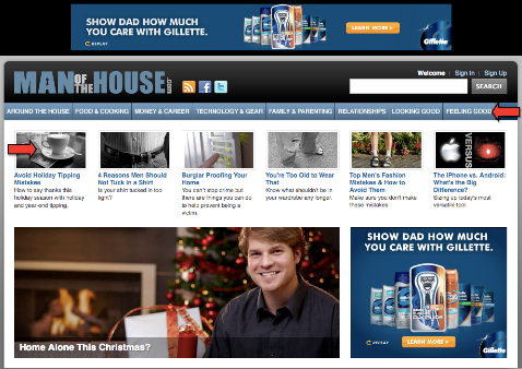
Also, similar to the Citrix blog mentioned earlier, this site also does not blast advertisements and push their products. Instead, they’ve built a site with great content and engaging features and subtly weave their marketing messages into the site, but only as a secondary outcome. Adding value for their audience with tips, tricks and ideas is their number-one goal.
The key is to create a site that caters to your target audience, and once you own the platform, you’re able to subtly weave in your marketing messages to a warm audience. If you do the hard work up front and do it consistently, you’ll create a platform that practically sells your brand and products for you!
Lastly, the Man of the House blog places social media sharing buttons at the top of each post, instead of the bottom where most people are used to seeing them. Because many readers will not read the entire blog post, placing the buttons at the top encourages readers to share their content.

Tip: Think about how you can address the needs of your audience even if it has nothing to do with your products or services. The more you can make your posts interesting to your target audience, they’ll consider your site as the “go-to source” for quality info and keep coming back for more.
#10: Delicious Days
Delicious Days is a front-runner when it comes to impeccable blog design and overall layout. This site is a great example of knowing what your audience will respond to and delivering your content in a way that grabs their attention.
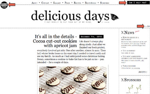
The use of white space and the black-and-white design makes the site easy to read and navigate. Notice how there’s not a lot of background noise and the clean, minimal look is inviting and calm.
Also, Nicky Stich and Oliver Seidel, the creators and designers of the blog, have added a feature that’s not often seen on most blogging sites. In the upper-right corner you’ll see a tab that reads, “Can I help you?” This serves as their website search tool.
In addition, the “A+” and “A-” buttons increase or decrease the font size of their blog site, again making their site even easier to navigate. These two features are great examples of taking care of your audience and addressing their needs front and center on your blog.
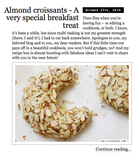
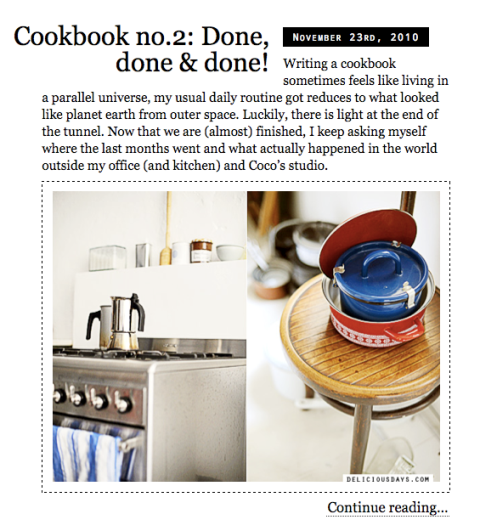
Also, Nicky knows what will lure her readers in, and in her case, its enticing photos. She is a master at mixing text with imagery to tell the story and evoke emotion. This is evident in the two images below.
Tip: Don’t underestimate the power of white space. It can make your blog more user-friendly and visually appealing to attract readers and keep your existing readers on your blog longer. Also, know what attracts your audience’s attention. If enticing photos will catch their attention, as with Delicious Days, use more photos! Keep it simple and give your audience what they want.
Attention Agency Owners, Brand Marketers, and Consultants

Introducing the Marketing Agency Show–our newest podcast designed to explore the struggles of agency marketers.
Join show host and agency owner, Brooke Sellas, as she interviews agency marketers and digs deep into their biggest challenges. Explore topics like navigating rough economic times, leveraging AI, service diversification, client acquisition, and much more.
Just pull up your favorite podcast app, search for Marketing Agency Show and start listening. Or click the button below for more information.
