Want to better understand your Facebook ad performance? Have you considered using Google Data Studio?
In this article, you'll discover how to create seven valuable Google Data Studio charts that can help you better analyze your Facebook advertising campaigns.
How to Create Charts in Google Data Studio
Data Studio is a free tool created by Google that can power endless variations of charts to showcase information from a variety of sources.
Social media marketers can create visualizations of data from Facebook Ads Manager and Google Analytics. From basic reporting tables to more advanced charts, marketers can better track and analyze Facebook advertising campaign performance by using Data Studio.
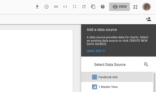
Data sources power charts created in Data Studio. A data source will connect the information from Facebook Ads Manager, Google Analytics, and other marketing platforms to Data Studio so that you can create charts within a reporting dashboard.
To create a data source, you'll pull in information from Facebook Ads Manager and Google Analytics using a connector for these platforms.
Google Analytics is a native connector in Data Studio, so you don't need any other integration to bring this data into your report. For Facebook Ads Manager, you can use a partner connector. Supermetrics is a popular option for integrations with Facebook Ads Manager, Facebook Insights, Instagram Insights, and others.
#1: Create a Data Source for Google Analytics
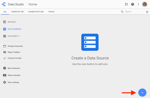
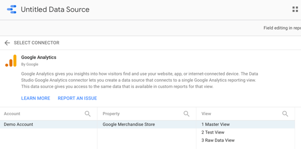
This will be the simplest data source you create. Go to the Google Data Studio data sources page. Then click the blue circle with a “+” sign to create a new data source.
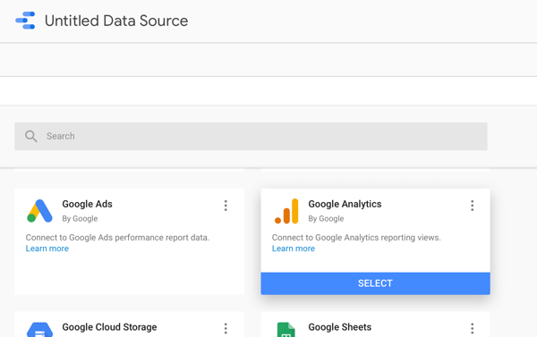
Next, you'll see your choices for connectors. You can scroll to or search for Google Analytics and select it.
Search for the name of your Google Analytics account and select the property and view of the data you want to analyze within your dashboard. Click Connect.
Get World-Class Marketing Training — All Year Long!
Are you facing doubt, uncertainty, or overwhelm? The Social Media Marketing Society can help.
Each month, you’ll receive training from trusted marketing experts, covering everything from AI to organic social marketing. When you join, you’ll also get immediate access to:
- A library of 100+ marketing trainings
- A community of like-minded marketers
- Monthly online community meetups
- Relevant news and trends updates
Next, the data source should automatically update to the name of the view you selected. If you want to rename it, click into the name of the data source in the top left.
#2: Create a Data Source for Facebook Ads
To create a Facebook Ads data source, follow a similar process to creating your Google Analytics data source. You'll need to use a partner connector to pull data from Ads Manager into Data Studio.
Supermetrics offers a 14-day free trial to test the service's full capabilities. It also offers a free version that allows you to pull the last 10 days of data, and low-cost paid plans starting at $19 per month.
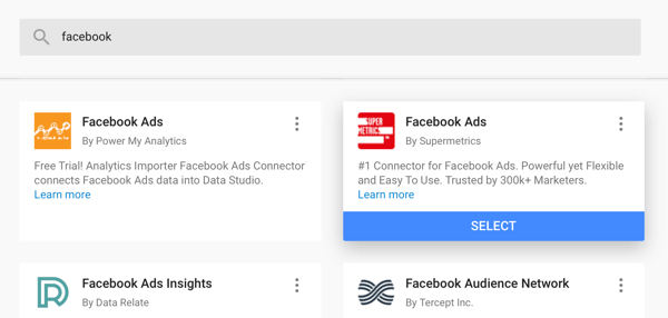
To create a Facebook Ads Manager data source using Supermetrics, return to the data sources main page and click the blue Add button again.
Search for or find the Facebook Ads connector from Supermetrics and select it.
When creating a Facebook Ads Manager data source for the first time, you'll need to log into your Facebook account. Supermetrics prompts you to do this with “To add more/manage Facebook Ads user accounts, visit” and provides the link to add your Facebook account.
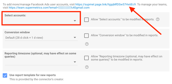
Next, you'll select your ad account from the drop-down menu. Make sure to match the conversion window settings to the attribution window settings in your ad account, as well as the reporting time zone.
To report on conversions directly through Facebook Ads Manager, you'll need to set up standard event tracking with the Facebook pixel.
Finally, rename the data source to match the name of your ad account or business.
#3: Build a Chart Using Data Settings
Start with a blank report in Data Studio. Go to the Data Studio home page and click the blank template in the top left.
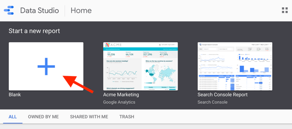
Data Studio will create a new report, which you can rename in the top left.
Next, you want to add your data sources for Facebook Ads to your report. Go to the right-hand column and select your Facebook Ads data source. You'll add the Google Analytics data source later.
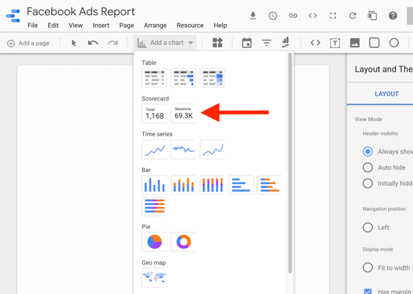
To create a chart, click Add a Chart in the navigation bar. Data Studio will provide the options for the type of chart to add to your report.
The simplest chart is a scorecard, so it's a great place to start for your first try. Select Scorecard from the options, and Data Studio will create it automatically.
#4: Customize the Chart With Style Settings
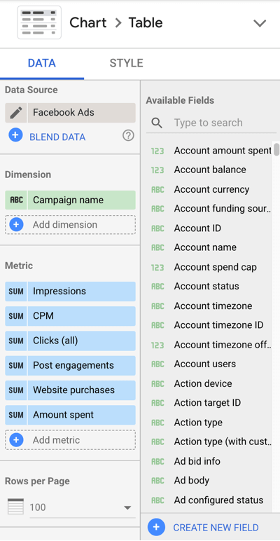
Each chart includes settings for both Data and Style, which can be seen in the right-hand column when a data source is selected in the report.
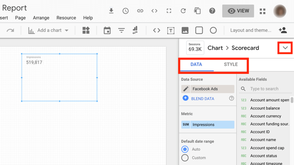
To look at the settings you'll explore with each chart, update the scorecard to a table. Go to the Chart settings right above the Data and Style settings and select the Table Chart option from the drop-down list.
Data Settings
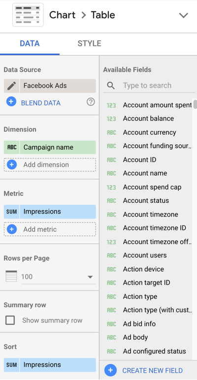
In the Data settings, you'll want to be familiar with:
- Dimension – a category of data, like campaign or ad set
- Metric – a number of a certain key performance indicator like impressions or conversions
- Sort – how to order or organize your data
- Date range – the time period of data you want to show, like last month
- Comparison date range – the time period you want to compare your data to, like last period
- Filters – specifications to show only certain data, like showing only conversion campaigns
- Segments (for Google Analytics) – the same segments you can apply to Google Analytics data like a custom segment to show only social media data
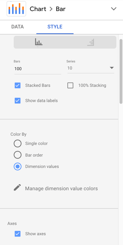
Style Settings
You can customize the size, color, and appearance of chart elements in your Style settings. For instance, you may want to customize your charts to match your company branding, or add drop shadows or backgrounds to charts.
7 Charts for Analyzing Facebook Ad Performance
Now that you have a foundational understanding of creating and customizing charts in Data Studio, let's explore seven different charts you can create to analyze your Facebook ad performance.
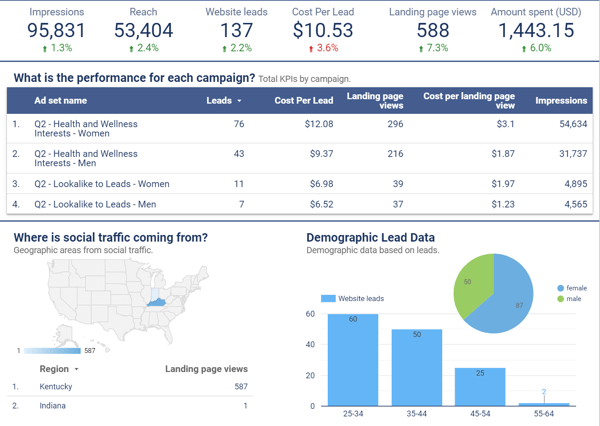
#1: Assess Overall Facebook Account Performance
Create a table that shows all of your ad account data to get a holistic view of your Facebook ad performance. Keep metrics high-level if you're including campaigns with multiple objectives.
This table is similar to the information you would see in Facebook Ads Manager. Use this chart to analyze overall performance for a specified date range.
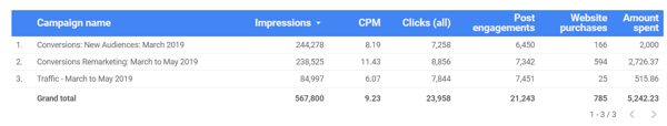
Chart Data Settings
- Data source: Facebook Ads
- Chart type: Table
- Dimension: Campaign name
- Metric: Impressions, CPM, clicks, post engagements, website purchases
- Select “Show Summary Row”
- Time period: most applicable time period for your analysis
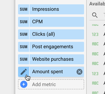
For any metrics that are currency, update the settings of the metrics to US Dollars. Hover over the metric you want to update and click the pencil edit button.
Then click into Type, select Currency, and find the currency that matches your data.
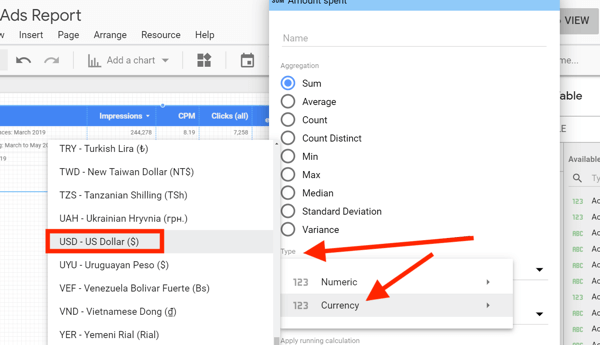
Chart Style Settings
Select Wrap Text under Table Header to make sure none of your table headers are cut off.
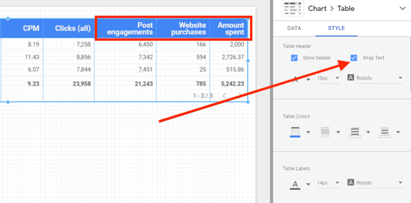
If any of your metrics show as null, update the selection under Missing Data to Show “0”.
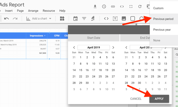
If you'd like to analyze these results in comparison to a previous time period, update the comparison date range in the Data settings.
Under the Style settings, you can choose which metrics you want to see the comparison data for. In the example below, impressions, clicks, and post engagement don't include comparison data.
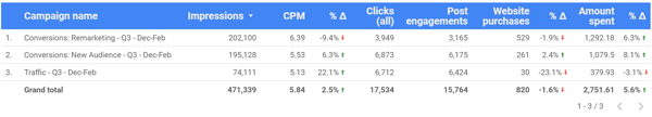
Use a chart with comparison data to analyze overall performance for a specified date range compared to another specified date range.
Discover Proven Marketing Strategies and Tips
Want to go even deeper with your marketing? Check out the Social Media Marketing Podcast! Publishing weekly since 2012, the Social Media Marketing Podcast helps you navigate the constantly changing marketing jungle, with expert interviews from marketing pros.
But don’t let the name fool you. This show is about a lot more than just social media marketing. With over 600 episodes and millions of downloads each year, this show has been a trusted source for marketers for well over a decade.
#2: Measure Campaign-Based Performance With a Heatmap
This table is very similar to the overall performance data; however, it differs because it focuses solely on one objective and includes a heatmap to visually categorize data with color.
To visualize this, use a filter to show only conversion campaigns and report on purchases, cost per purchase, ROAS, and purchase conversion value for each campaign and/or ad set to see how they stack up against each other.
Add this table to your report to compare campaigns against each other when they use the same objective. Also, use this table to compare ad set performance within a specific campaign.
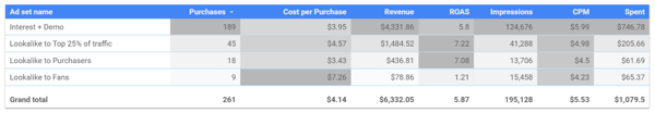
The chart above shows four ad sets within a campaign optimized for purchases. The highest metric in each column is the darkest color and the lowest number in each color is the lightest. You can see that the lookalike audience to this Facebook page's fans drove the lowest purchases at the highest cost and had the lowest ROAS. When optimizing, you would consider turning off this ad set.
Chart Data Settings
- Data source: Facebook Ads
- Chart type: Table with heatmap
- Dimension: Ad set
- Metrics: Website purchases, cost per website purchase, website purchase conversion value, ROAS, impressions, CPM, amount spent
- Select “Show summary row”
- Sort: Website purchases, descending
- Time period: most applicable time period for your analysis
- Filter: Include, Campaign objective equal to CONVERSIONS
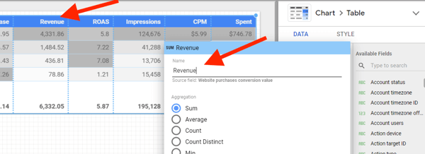
You might have noticed that the table headers in the chart above look different from the metrics included in the data settings listed. Edit the name of a metric to better match what that metric represents. To illustrate, update “Website purchase conversion value” to “Revenue” to clean up the appearance of your table.
To edit a metric name, hover over the metric in the Data settings and click the pencil icon that appears.
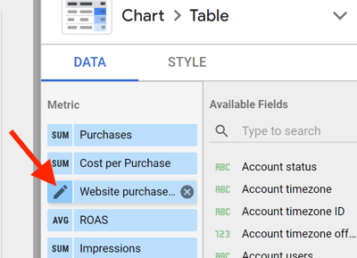
Then update the metric name to a shortened or more direct name. You'll still see the original name below the updated one for reference.
To create the filter for this chart, click Add a Filter under Filter > Table filter.
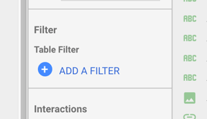
Create the conditions to include campaigns with the objective equal to conversions. This filter will narrow the data in your chart to only the campaigns with a conversion objective.
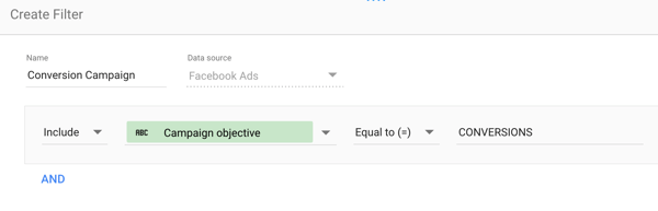
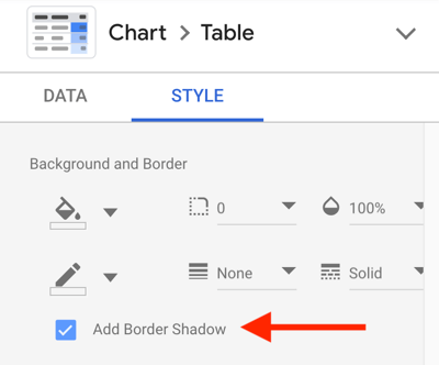
Chart Style Settings
- Update the heatmap colors of each column to the color of your choice.
- Add a border shadow for appearance.
#3: Track Campaign Results by Demographic Data
Create a stacked bar chart to show results by age and gender information. Use this chart to understand the ages and gender driving the most results from your campaigns. This chart comes in handy when reporting on high-value actions like leads and purchases to determine where to allocate your Facebook ads budget.
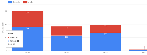
Chart Data Settings
- Data source: Facebook Ads
- Chart type: Stacked bar chart
- Dimension: Age
- Breakdown Dimension: Gender
- Metric: Website leads
- Sort: Age, ascending
- Time Period: most applicable time period for your analysis
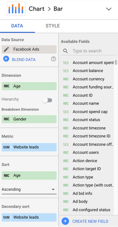
Chart Style Settings
- Bar chart
- Select “Stacked Bars”
- Select “Show data labels”
- Select “Show axis title” under Left Y-Axis settings
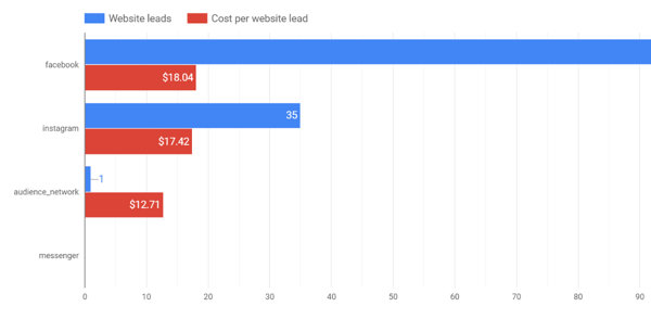
#4: Analyze Platform or Placement Performance With Cost-per-Result Breakdown
Analyze platform and placement results with a horizontal bar chart showing results and cost per result for each. If you're currently using automatic placements for your campaigns across Facebook, Instagram, Audience Network, Messenger, and Stories, these types of charts show where you're driving results and at what cost.
Use Publisher Platform as the dimension when you want to see the performance between Facebook, Instagram, Audience Network, and Messenger.
Use Placement as the dimension when you want to dive deeper into which placements within each platform are driving results and at what cost.
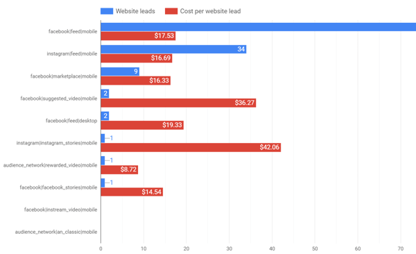
Chart Data Settings
- Data source: Facebook Ads
- Chart type: Horizontal bar
- Dimension: Publisher platform or placement
- Metric: Website leads (results) and cost per website lead (cost per result)
- Sort: Website leads, descending
- Time period: most applicable time period for your analysis
Chart Style Settings
- Select “Show data labels”
Create filters to narrow your data to show only campaigns with the same objective to get a more accurate picture of results for those campaigns.
#5: Reveal Results and Cost Per Result Trends Over Time
Do you have questions like, “How do I know if I'm making long-term progress with my optimizations?” If you do, you'll love this chart.
Create a bar chart to show results per month (or day, week, etc.) over an extended period. Use this type of chart to analyze performance over a quarter, month, or year depending on what type of data you want to see.
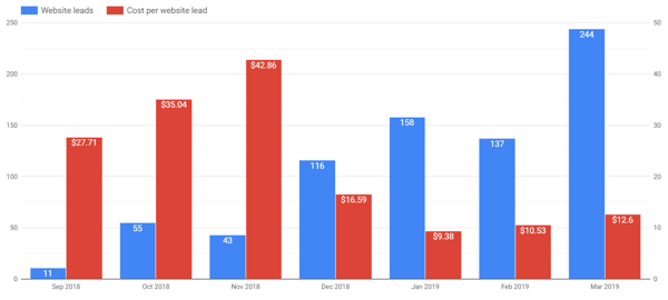
With this chart, you'll want to see how your results trend in comparison to your cost per result. In the chart above, leads increased over time and cost per lead showed significant improvement from December to January compared to September through November. When analyzing this data, keep in mind the effect that overall ad spend will have on your total number of results.
Chart Data Settings
- Data source: Facebook Ads
- Chart type: Vertical bar
- Dimension: Year and month (or other applicable time period)
- Metrics: Website leads (results) and cost per website lead (cost per result)
- Sort: Website leads, descending
- Time period: most applicable time period for your analysis
Chart Style Settings
- Select “Show data labels”
- Select “Double” under Axes settings
#6: Display Website Engagement From Facebook Campaign Traffic
Build a chart from Google Analytics data to display your campaign traffic and engagement metrics with your site including average session duration and average time on page. Evaluate the quality of traffic coming from your campaigns.
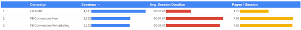
To add the Google Analytics data source to your report, select Table With Bars from the Add a Chart menu. Click on the Facebook Ads data source and search for the Google Analytics Data data source for your website.
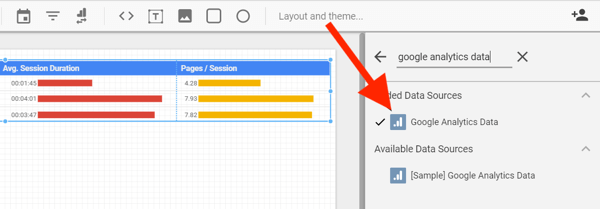
Chart Data Settings
- Data source: Google Analytics
- Chart type: Table with bars
- Dimension: Campaign
- Metric: Sessions, average session duration, pages/session
- Sort: Sessions
- Time period: most applicable time period for your analysis
- Segment: Create a segment in your Google Analytics account to show only traffic from Facebook sources
Instead of creating a segment in Google Analytics, you can also create a filter within Data Studio to include only Facebook campaign traffic.
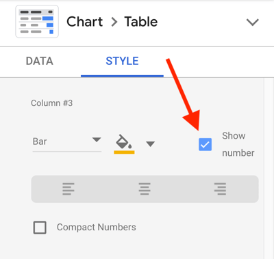
Chart Style Settings
- Select “Show number” for each metric
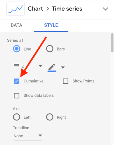
#7: Compile Cumulative Data Year Over Year
Show big-picture data with year-over-year comparison charts. Determine how you're pacing throughout the year in comparison to data from last year's Facebook advertising efforts with a chart that shows cumulative data for the current year compared to the previous year.
This chart works well with Facebook Ads data and Google Analytics data.
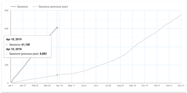
Chart Data Settings
- Data source: Google Analytics or Facebook Ads
- Chart type: Time series
- Dimension: Date
- Metric: Session or other metrics
- Time period: This year compared to previous year
- Segment: Create a segment in your Google Analytics account to show only traffic from paid Facebook sources
Chart Style Settings
- Select “Cumulative” under Series #1
Conclusion
This article provides several ways to integrate your Facebook Ads Manager and Google Analytics data into Google Data Studio for better reporting and analysis. Use these recommendations, along with other customizations, to make the most of Data Studio and improve your Facebook advertising.
What do you think? Which charts have you created to gain more insight into your Facebook ad campaign performance? Which of these charts will you integrate into your Data Studio dashboards? Share your ideas in the comments below.
More articles on Google Data Studio:
- Find out how to create and share Google Data Studio dashboards and reports.
- Learn to use Google Data Studio to create easy-to-update reports for your website, Facebook, or Instagram marketing.
Attention Agency Owners, Brand Marketers, and Consultants
Introducing the Marketing Agency Show–our newest podcast designed to explore the struggles of agency marketers.
Join show host and agency owner, Brooke Sellas, as she interviews agency marketers and digs deep into their biggest challenges. Explore topics like navigating rough economic times, leveraging AI, service diversification, client acquisition, and much more.
Just pull up your favorite podcast app, search for Marketing Agency Show and start listening. Or click the button below for more information.